Report configuration
You can adjust the report configuration to get different views of the data. Depending on the nature of the adjustment, you may need to rerun the report.
Data source
Cloud Analytics reports support the following data sources:
-
Billing data (default): Use cloud billing data as the data source. If there are data imported via the DataHub API, you'll be able to select the checkbox to Include DataHub data.
-
BigQuery Intelligence: Use the BigQuery Intelligence audit log sink as the data source. Queries run in the Google Cloud billing project of the Google Cloud account you have connected to DoiT Cloud Intelligence, and consume that project's BigQuery resources. Reports with large audit-log datasets or wide time ranges may take longer to run or time out. See Analyze BigQuery activities.
-
Kubernetes Utilization: CPU and memory utilization data of Kubernetes clusters. See Kubernetes utilization data.
Metric
Cloud Analytics supports various metric categories for tracking and evaluating cloud usage, costs, and performance.
-
See Metrics when the data source is cloud billing data.
-
See Metrics and dimensions when the data source is the audit log sink of BigQuery Intelligence.
-
See Kubernetes utilization data: Extended metrics when the data source is Kubernetes Utilization.
You can add multiple metrics to a single report to gain comprehensive insights into your cloud spend and usage. See Multi-metric reports.
Time
The Time settings allow you to configure time aggregation, compare data across different periods, and choose whether to exclude incomplete time intervals from your report.
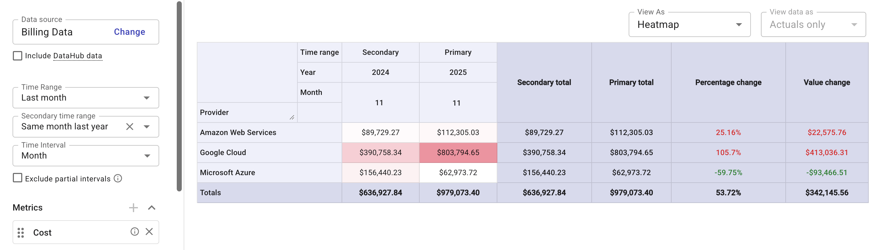
Time range, Secondary time range, and Time interval
Specify how your data points are aggregated over time.
-
Time Range: Select the primary time range of the report. You can choose a predefined time range or define a custom range.
-
Secondary time range: Select a secondary time range to compare with the primary range. You can choose the secondary range from the list of suggested options or define your own using the calendar. The secondary range doesn't have to match the length of the primary range. For example, you can compare data from the current month with data from a single week last year.
Note that specifying a secondary range automatically turns off the Forecast feature and all the Aggregation options except Total.
-
Time Interval: Choose from Hour, Day, Week, Month, Quarter, and Year. This option applies to both Time Range and Secondary time range.
Changing the time interval will affect the Date/Time dimensions. For example, selecting the Time Interval Hour will automatically add Hour to the X-axis (horizontal) of a report chart.
Exclude partial intervals
When viewing a report, the most recent interval is often still in progress. For example, in a Daily report, the current day continues collecting billing data throughout the day.
The Exclude partial intervals option removes the in-progress interval at the end of the time range, such as the current day for daily intervals, the current week for weekly intervals, and the current month for monthly intervals. Removing incomplete periods prevents skewed trends and improves analytics accuracy.
Note that the exclusion is a calendar-based rule, not a data-completeness check:
-
It only drops the currently open interval at the end of the range. It has no effect if the selected time range already ends in the past (for example, a "Last 7 Days without the current day" range that ends yesterday).
-
It does not verify data completeness. Cloud billing data can arrive after an interval closes. This option only cuts off the active calendar period; it does not detect or wait for background data processing to finish.
The same trimming applies to both the primary and the secondary time range.
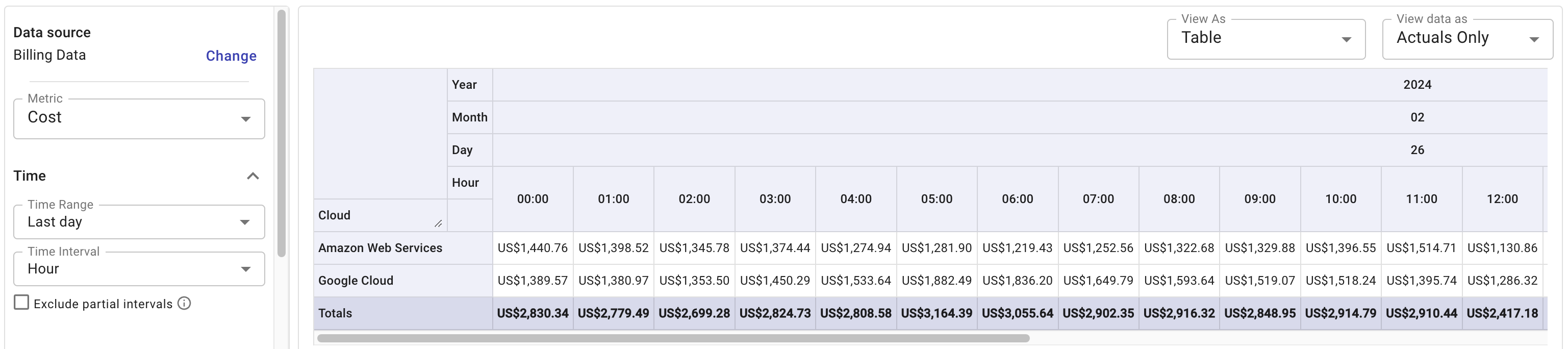
Time zone in multicloud reports
DoiT Cloud Analytics keeps the time zone and daylight saving time applied to cost and usage data by cloud providers without adjustment. For reports that contain data from multiple cloud providers, it means data presented at the same hour may actually be several hours apart.
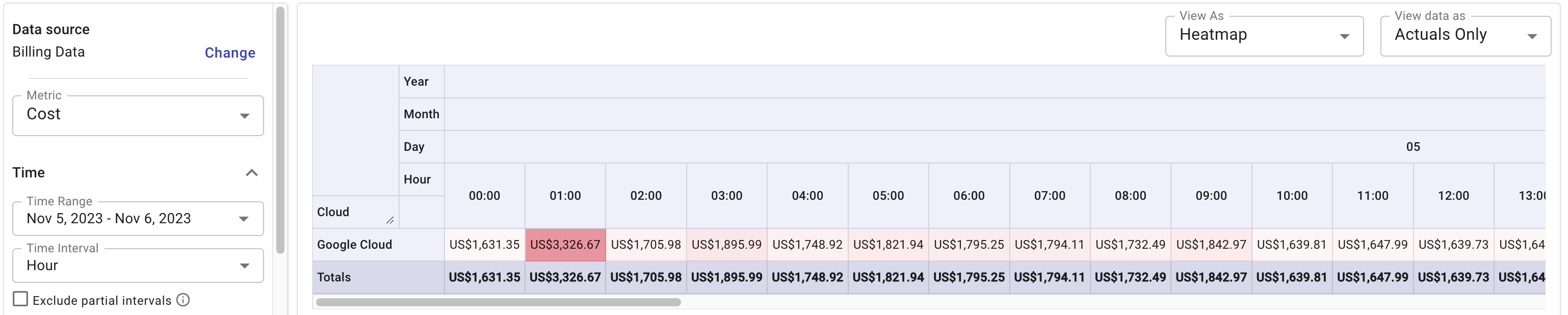
In the example below, cost data on February 26 is aggregated by hour. While the hour 08:00 means UTC time for AWS data, it is Pacific Time for Google Cloud data.
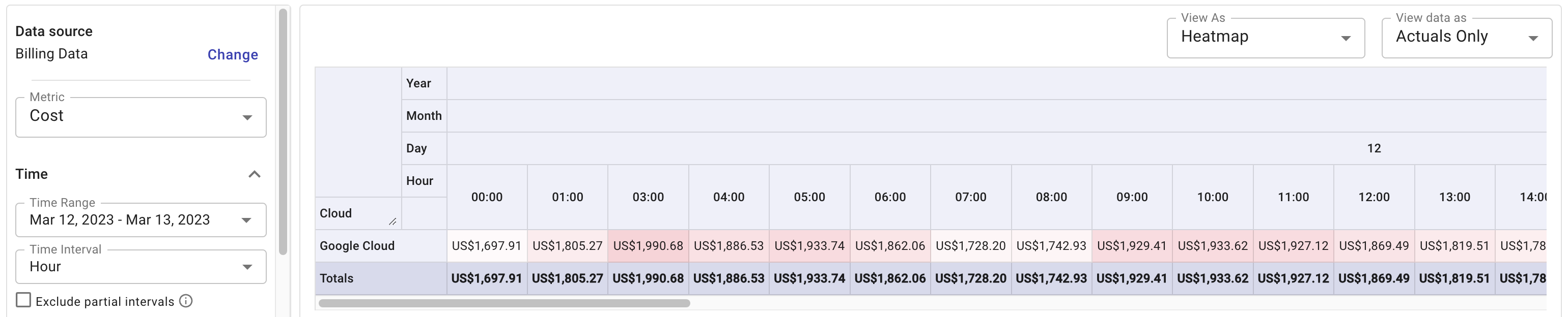
Daylight saving time
Google Cloud billing data observes daylight saving time shifts in the United States; the impacts on cost data are also reflected in Cloud Analytics reports.
In the two examples below, the first one skips the hour 02:00 on March 12, 2023 when daylight saving time started, and the second one shows a higher amount of cost at the hour 01:00 on November 5, 2023 when daylight saving time ended (the amount covers the period 01:00 – 02:00 twice). Note that these adjustments come from Google Cloud, which means you'll see the same in the Google Console.
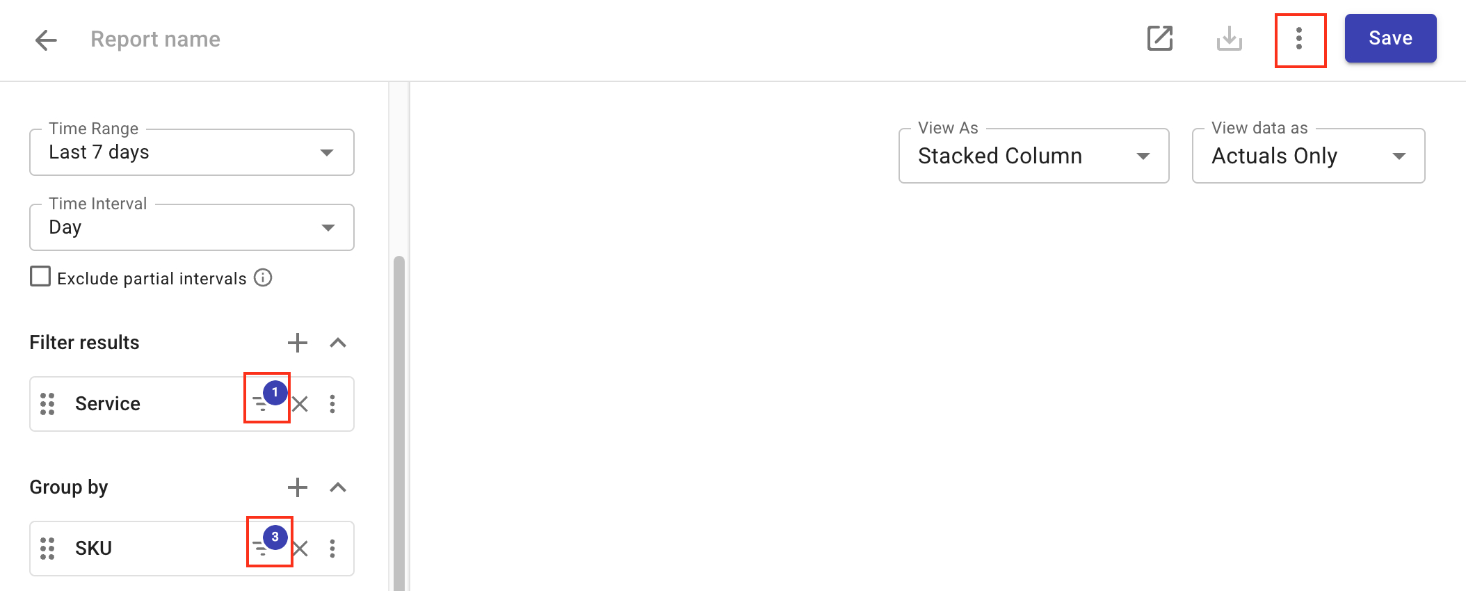
Filter results
Filters allow you to refine your report. For example, by cloud providers (using the standard dimension Cloud), Services, or other dimensions, tags, or labels.
Dimensions with applied filters are displayed with a filter icon and the number of conditions. You can select Report configuration from the kebab menu (⋮) in the report title bar to view the details.
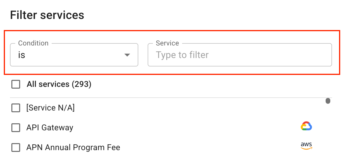
Configure filter clauses
A filter clause specifies the condition for including or excluding data from your report.
Exact, partial, and regex match
When defining the condition, you can choose from the following operators:
-
Exact match: is, is not.
-
Partial match: starts with, ends with, contains, does not contain. Matches part of a value or matches based on a pattern.
-
Regex match (also known as advanced operators): matches regex, does not match regex. Pattern matching using regular expressions.
For a partial or regex match, the search results are not reflected in the filter dialog. Run the report to check whether the filter works as expected.
Use regex
Regular expressions (regex) provide a powerful, flexible way to search text based on patterns formed by a sequence of characters. The DoiT console allows regular expressions written in the syntax accepted by RE2.
For example, the regex (?i)(playground|sandbox) matches either playground or sandbox, regardless of the casing. Applying this regex to the Project/Account names dimension will select all projects that have playground or sandbox (case-insensitive) in their names.
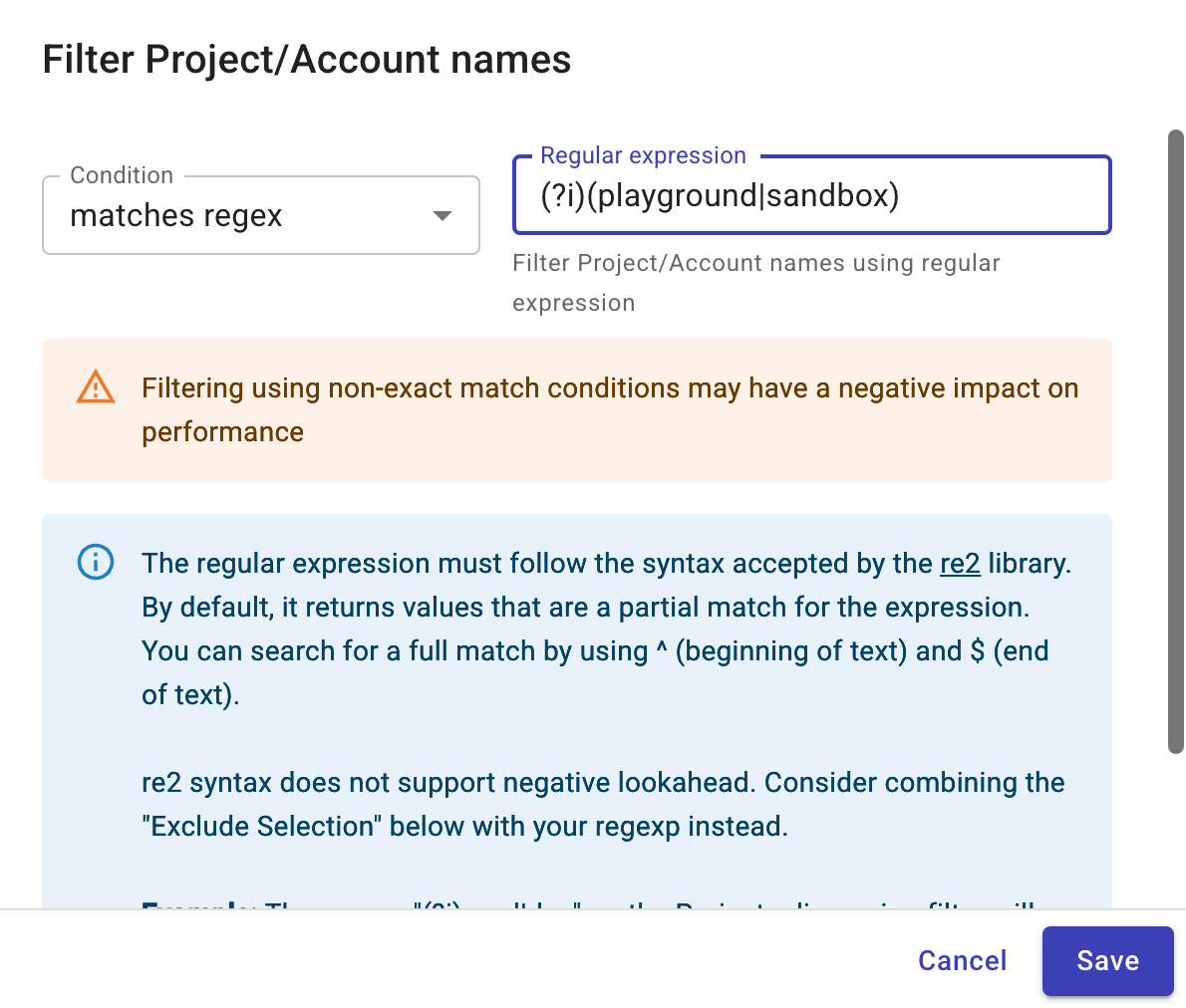
RE2 syntax does not support negative lookahead. Consider choosing does not match regex if needed.
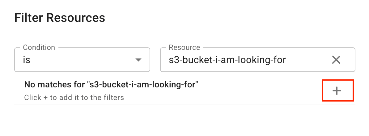
No matches or incomplete results
If the amount of data in your report exceeds the Data ingestion limits, you may get empty or incomplete search results when filtering. There are two ways to get the desired results in such situations:
-
Use a partial or regex match.
-
If you're using exact match, select the + button to add the specific value directly to the filters.
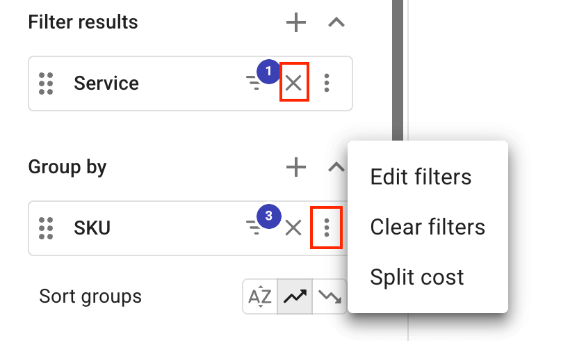
Clear filters
To clear filters on a specific dimension:
-
For items in the Filter results section, select the cross/delete icon (✗).
-
For items in the Group by section, select the kebab menu (⋮) at the rightmost end and then select Clear filters.
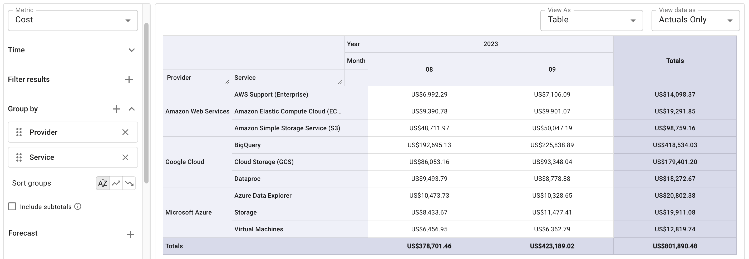
Group by
The Group by section adds dimensions along the Y-axis (vertical) of a chart. They define the rows that appear in the tabular formats.
To view your data on a more granular level, you can add multiple Group by options to form hierarchical groups (subgroups). Note that when grouped by two or more dimensions, the report defaults to the Table view.
Sort groups
Cloud Analytics reports support the following sort options for groups:
-
Alphabetical sort (default setting for table views): sort by group name
-
Row total ascending (default setting for charts), row total descending: sort by row total. Row totals are found in the rightmost cells in the column called Totals when viewing in tabular formats.
The example below sorts the rows in alphabetical order.
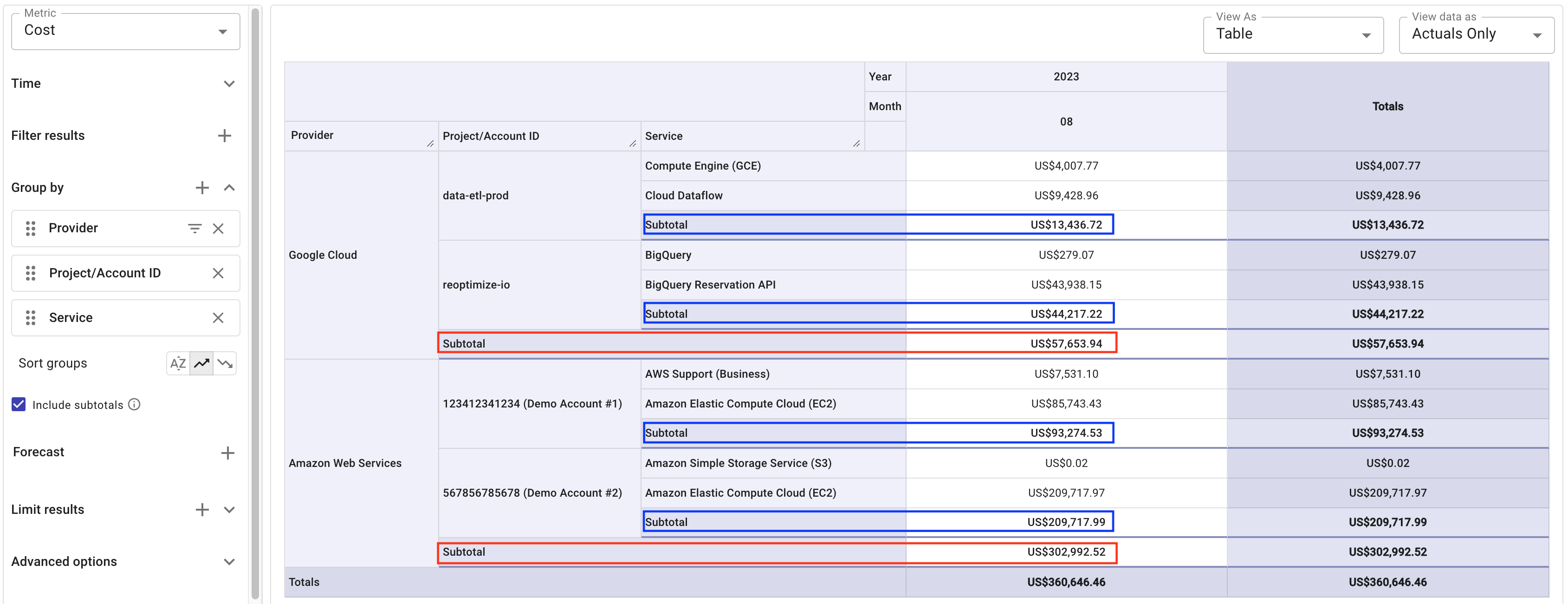
Include subtotals
When viewing a report grouped by more than one dimension in tabular formats (Table or Heatmap views), you can select the checkbox Include subtotals to display the subgroup totals in the report.
For a report that includes subtotals, the subtotal ascending/descending sorting options work as below:
-
First, sort by the subtotals of the top-level groups.
-
Then, sort by the subtotals of the immediate next-level subgroups.
In the example below, the results are sorted in subtotal ascending order.
Data point limits
The DoiT console limits the maximum number of data points to 30,000 to ensure a quick and accurate rendering of reports in web browsers.
If your report fails to run due to the data point limit, try to select fewer Group by options, filter results, limit results, or use the Reports API.
Forecast
The forecast feature helps you estimate future cloud spend based on historical data. See Forecast cloud costs for how to specify the historical periods, forecast horizon, and forecast granularity.
The Forecast feature is unavailable if you specify a secondary time range or have more than one metric in the report.
Limit results
When building a report, you can limit the results based on metric values, period-over-period changes, or metric value-based rankings.
Cloud Analytics allows up to two limit types on a single report. When multiple limit types are configured, the evaluation order is: Limit by value → Limit by change → Limit by rank.
When in Compact mode, the Limit results configuration appears as an icon in the toolbar.
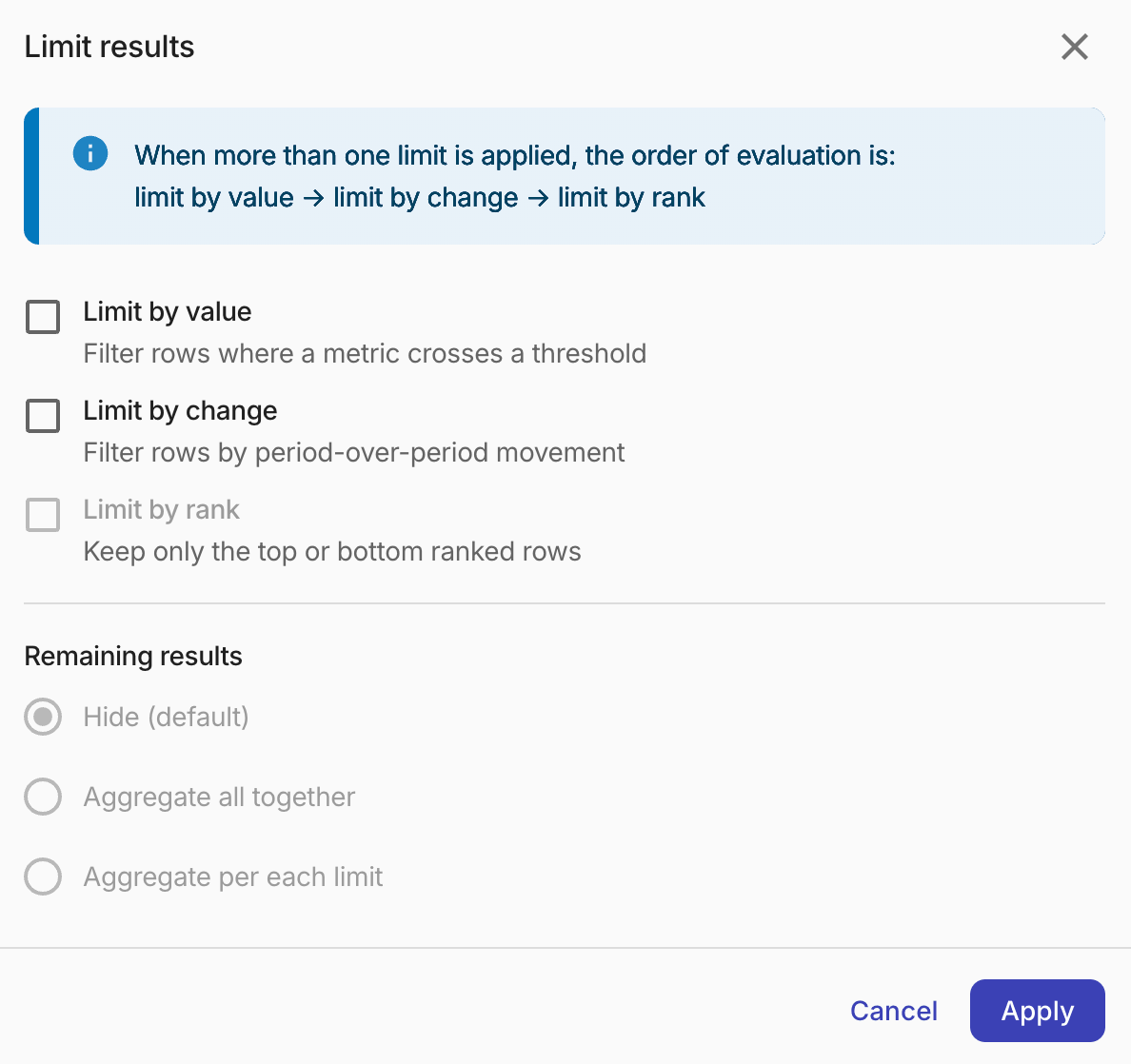
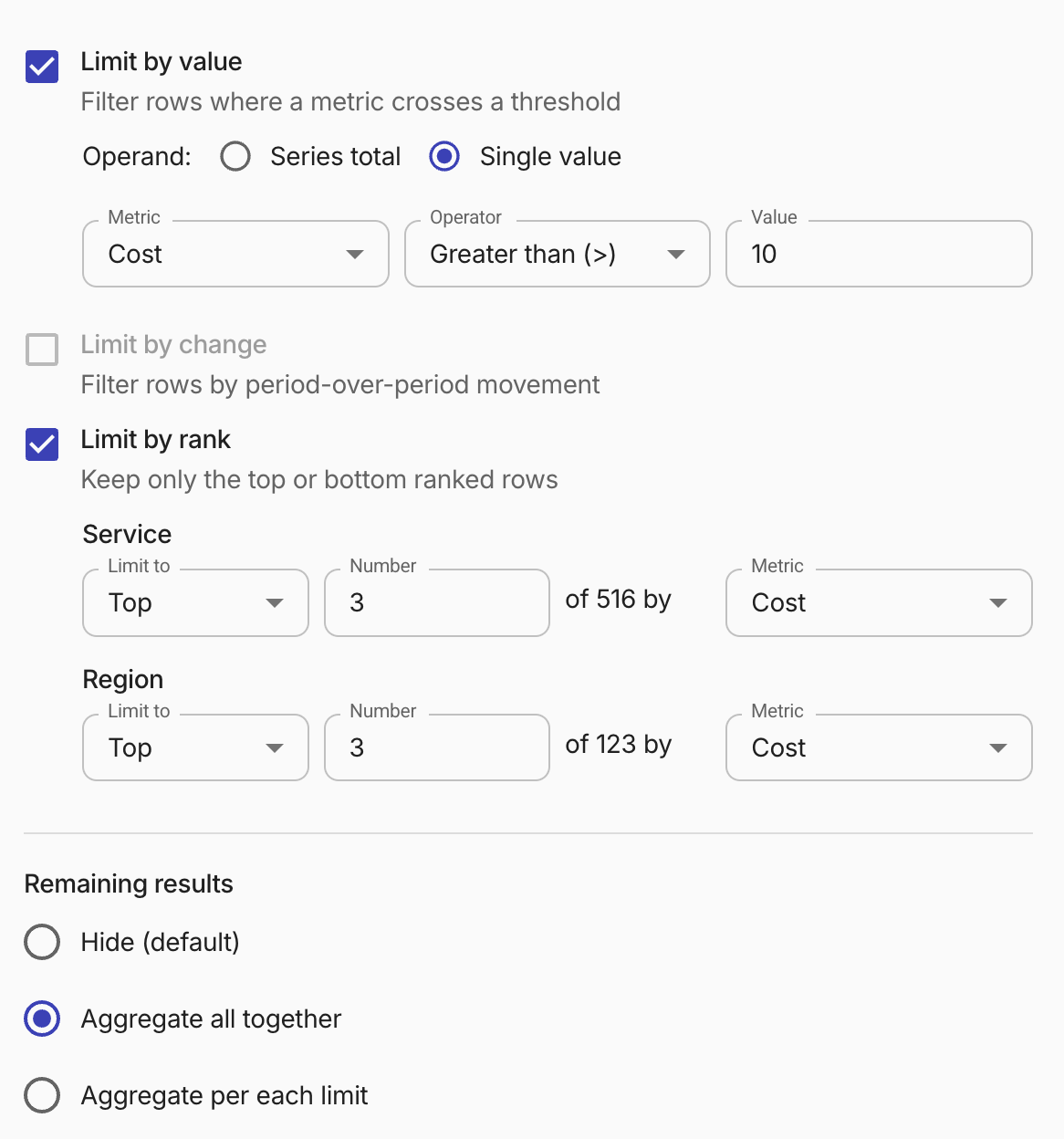
Limit by value
The Limit by value option filters rows where a metric value crosses a threshold.
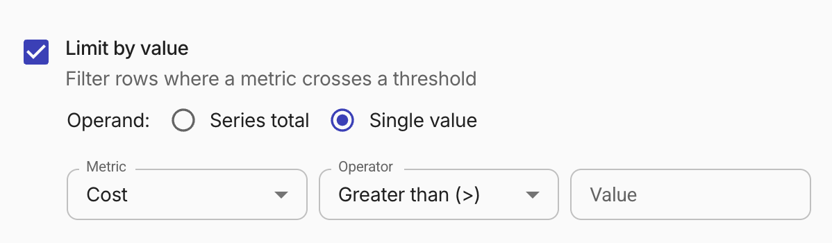
-
Operand: Specifies how the filter threshold is evaluated.
-
Single Value (Default): Compares the threshold against each individual cell value. A row is excluded if any single cell fails the filter.
-
Series total: Compares the threshold against the total of a row's metric values. A row is excluded if the total fails the filter.
-
-
Metric: By default, the metric is the same as the report's metric. You can choose different metrics to limit the results. For example, select Usage as the report's metric while limiting results to those with a Cost greater than $50.
-
Operator and Value: Define the threshold condition. Supported operators: Greater than (>), Less than (<), Greater than or equals (>=), Less than or equals (<=), Between, Not Between, Equals (=), Not equals (≠). For Between and Not Between, specify both a lower and upper bound.
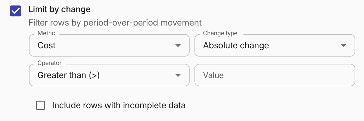
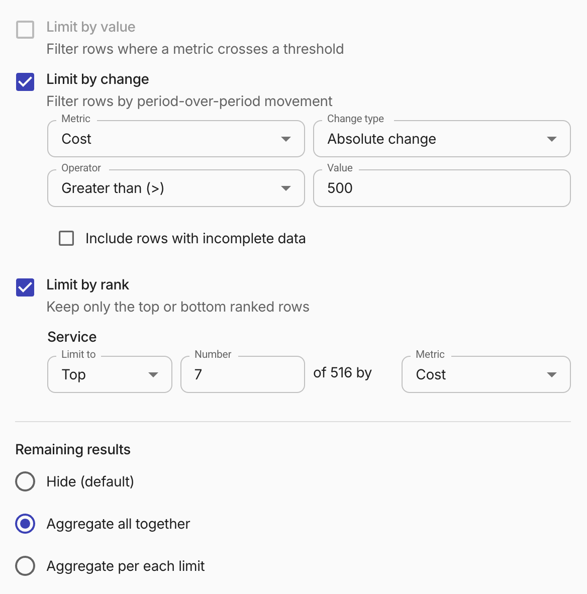
Limit by change
The Limit by change option filters results based on how much a metric's value changed between consecutive time intervals. For example, you can filter to show only services whose cost increased by more than 20% period over period.
-
Metric: The metric to evaluate. By default, this is the report's metric.
-
Change type: Select
Absolute changeto compare the raw difference between periods, orPercentage changeto compare the percentage change. -
Operator and Value: Define the threshold condition. Supported operators: Greater than (>), Less than (<), Greater than or equals (>=), Less than or equals (<=), Between, Not Between. For Between and Not Between, specify both a lower and upper bound.
-
Include incomplete data: Select this checkbox to include the current in-progress period (potentially incomplete) in the change calculation.
A row is included if at least one period-over-period delta on the chosen metric satisfies the filter condition (the first time period of every row is shown but excluded from change evaluation). Rows that do not pass are handled according to the remaining results setting.
Limit by rank
The Limit by rank option becomes available once you add at least one Group by dimension. For each dimension, you can specify the following settings:
-
Limit to: Whether to display the Top or Bottom ranked results.
-
Number: The number of rows to display.
-
Metric: The metric by which the dimension is measured.
Remaining results
The Remaining results section specifies how to handle results that fall outside the limit:
-
Hide (default): Hides the remaining results from the report. It also excludes the remaining results from the Totals of the report.
-
Aggregate all together: Aggregates all the remaining items in one line.
-
Aggregate per each limit: Aggregates the remaining items per dimension.
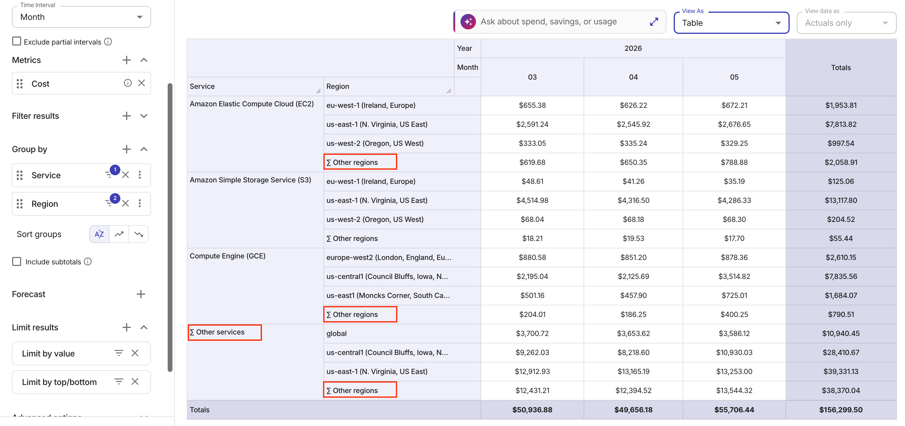
Aggregated lines in a report start with the leading character ∑, followed by the respective dimension labels.
When the report is in comparative mode, remaining results aggregation is disabled and the Remaining results setting is automatically set to Hide.
Limit results examples
The examples below show two limit results configurations and their outputs.
Limit by value and rank
Limit by change and rank
![]()
Advanced options
The Advanced options help you identify trends and patterns, see costs in different currencies, specify an aggregation, include promotional credits in the report, and show trendlines for time series graphs.
When in Compact mode, the Advanced options are found in the Report Settings (gear) dialog in the toolbar.
Advanced analysis
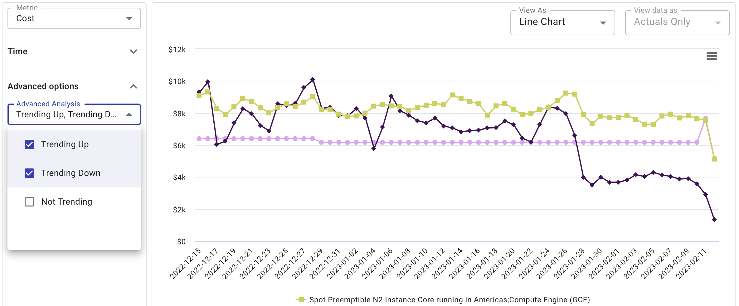
When analyzing cloud usage, it's easy to become overwhelmed by the sheer volume of data points. The Advanced analysis adopts the Mann-Kendall algorithm to remove noise and show only trending metrics.
Below is an example of the preset report Trending services, showing both trending-up and trending-down services.
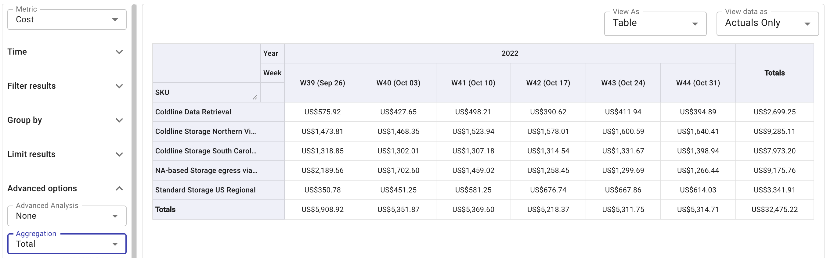
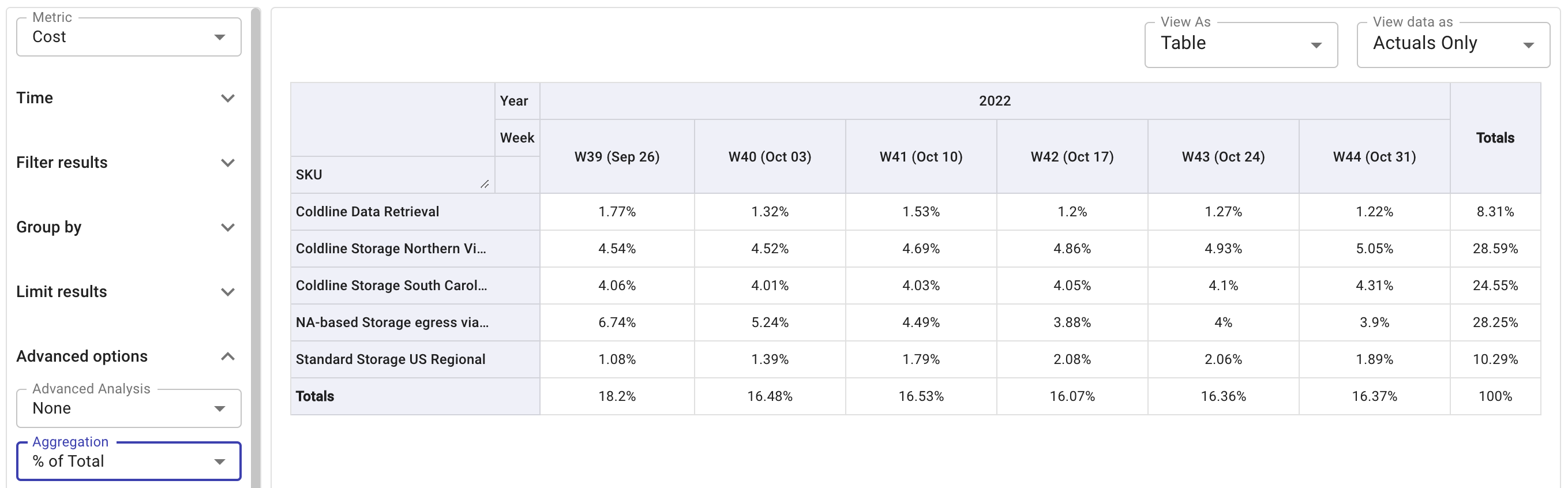
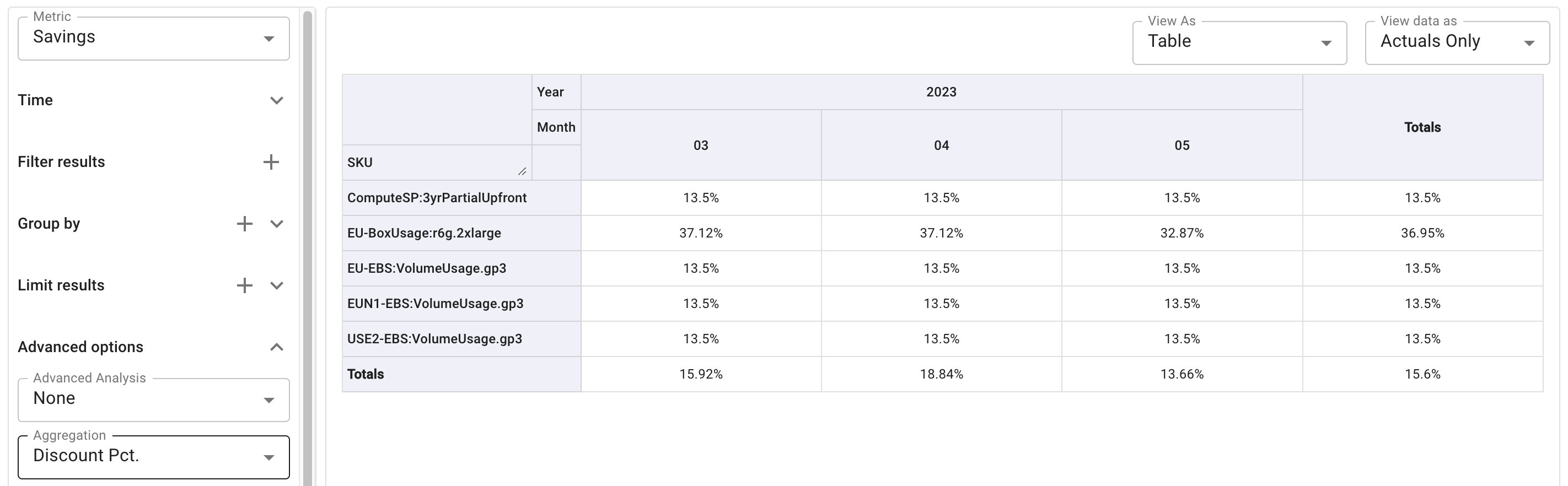
Aggregation
Aggregation helps you summarize and transform data into manageable and representative forms. Cloud Analytics supports multiple aggregation options. Most of them are available in different visualizations when the View data as setting is Actuals only.
If you specify a secondary time range in the report, the only available aggregation option is Total.
-
Total: The results are displayed in absolute terms. A row and a column, each titled Totals, are added at the end containing the sum of the results per row and column, respectively.
-
% of Total: Each result is presented as a percentage of the total sum.
In a Table view, a column titled Totals is added at the end containing the sum of the results per row, expressed as a percentage.
-
% of Row: Displays cell values as a percentage of its row.

-
% of Column: Displays cell values as a percentage of its column.

-
Count: This option counts the number of occurrences of a specific dimension. It is useful for identifying the frequency of certain events or items within your dataset. For example, you can use this option to determine the number of active cloud resources, or the number of unique accounts, projects, or services incurring costs within a given time period.
Note that the Count aggregation is irrelevant to metrics. In addition, the dimension to be counted will be excluded from Group by. See Unique accounts, projects, or resource groups for an example.
-
Unit Cost (available only for the Cost metric): Mainly used for cost-per-unit pricing validation.
Unit cost is associated with a specific unit of cloud resources or services, for example, compute, storage, or data transfer. It helps organizations understand the cost efficiency of their cloud usage.
-
Discount Pct (available only for the Savings metric): This option is typically used to check the discount percentage (e.g., AWS Enterprise Discount Program (EDP or PPA)) applied at the SKU level.
Currency
Currency that the billing data is reported in (Metric must be Cost). See Supported currencies.
-
For the current month, we always apply the latest exchange rate (the rate of the present day or the day before) to the whole month.
-
Once it passes the last day of a calendar month, we apply the exchange rate of that last day to that whole month. See Exchange rates for more information.
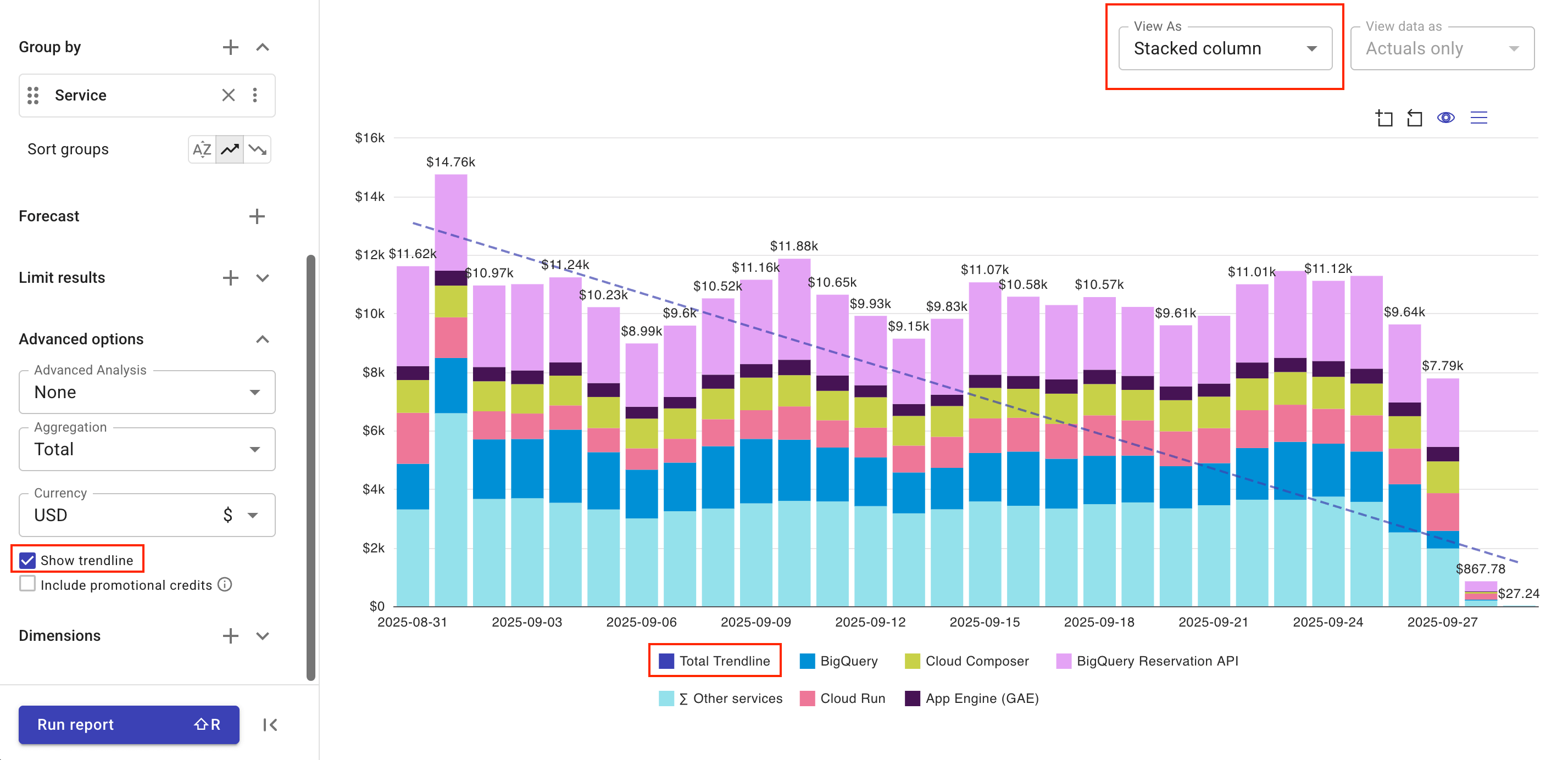
Trendline
A trendline is a charting tool that depicts the overall direction of your data. DoiT Cloud Analytics supports linear trendlines for Stacked column and Stacked area charts.
To add a trendline to your chart:
-
Make sure you're viewing the chart as Stacked column or Stacked area.
-
Select the Show trendline checkbox.
You'll see a straight linear trendline across the chart. (You can select the Total Trendline chart legend to display or hide the trendline.)
 Tip
TipThe trendline is calculated only from historical data, not forecasted values. If your report includes forecasting, the trendline extends into the forecast area on the chart for a smoother visual transition.
Promotional credits
Promotional credits in the DoiT console are migration credits, commitment credits, vendor program credits, and other credits you receive from DoiT, including those passed to you via DoiT. They do not include credits directly applied to your billing data by your cloud providers.
-
Google Cloud customers, AWS customers on DoiT consolidated billing accounts: DoiT promotional credits are applied to the monthly invoices.
-
To view these credits in a Cloud Analytics report, you need to aggregate data with monthly or greater time interval and also select the checkbox Include promotional credits.
-
Starting January 1, 2026, by default, DoiT auto-forwards promotional credits from Google Cloud to eligible customers (the auto-forwarding feature is not disabled and there are no active credits on the customer's billing account). You can filter by Credit type
PROMOTIONto view the application of such credits. See an example report with auto-forwarded GCP promotional credits.
-
-
AWS customers on dedicated payer accounts: DoiT promotional credits are applied to the billing data.
To view these AWS credits in a Cloud Analytics report, you can use the dimension Cost Type and set it to
Credits. In such a case, the checkbox Include promotional credits is irrelevant.
Promotional credits do not cover discounts, private pricing, AWS Enterprise Discount Program (EDP or PPA), or Flexsave savings unrelated to credits. See Credits and discounts for how to view various credits and discounts.
Dimensions
The Dimensions section adds fields along the X-axis (horizontal) of a chart. They define the columns that appear in the tabular formats. When creating a new report, the Date/Time dimensions Year, Month, and Day are added by default.
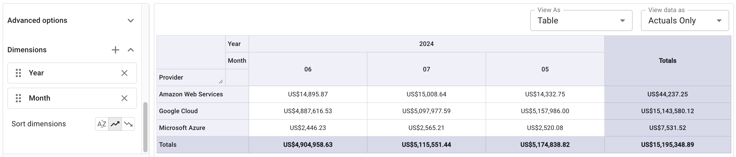
Sort dimensions
Cloud Analytics reports support the following sort options for dimensions:
-
Alphabetical sort (default setting): sort by column title
-
Column total ascending, Column total descending: sort by column total. Column totals are found in the bottom row called Totals when viewing in tabular formats.
The example below sorts the columns in column total ascending order.
View as
Based on the data you have and the tasks you want to perform, you may need different data visualizations. Below are the visualization types you can choose from the View as list:
-
Tabular and matrix views: Display data in text or grid form, usually for precise values and detailed comparisons (see also Search in table).
-
Table: This is the most basic way to view numbers. It's best for showing exact values, displaying detailed breakdowns, and exporting data for external analysis.
-
Heatmap: A heatmap colors each cell in a table based on its value. Higher values typically have a more intense color, making it easy to spot high-magnitude data points.
-
Row heatmap: A variation of the heatmap where the color scale is applied independently to each row. A typical use case is comparing daily spend within the same service.
-
Col heatmap: Similar to the Row heatmap, but the color scale is applied independently to each column. A typical use case is comparing services on a specific day to see which contributes most to the spend.
-
-
Bar and column charts: Also known as categorical comparison charts, these visualization types help you compare discrete categories such as cloud services, project teams, or environments against each other.
-
Column chart: Vertical bars for comparing quantities over time or across categories. For example, monthly spend per cloud provider or per service.
-
Stacked column: A column chart where each vertical bar is split into segments to show both the total value for the category and its proportional breakdown. See the Cost by top projects report for an example.
-
Bar chart: A horizontal version of the column chart.
-
Stacked bar: A horizontal version of the stacked column chart. See the AWS Cost by service report for an example.
-
Column and Line: A combination of vertical bars and line graphs on a single chart, using multiple Y-axis to display datasets with different metrics. This option is ideal for showing relationships and trends between metrics. See Multi-metric reports for an example.
-
-
Hierarchical and flow visualizations: These visualization types help you explore complex relationships, such as how costs are composed or allocated across your organization, as well as data flows.
-
Treemap: Displays hierarchical data as a set of nested rectangles. As the area of each rectangle is proportional to its value, a treemap is often used to quickly identify major contributors in a hierarchical dataset. See the Services breakdown report for an example.
-
Sankey chart: A type of flow diagram that shows how values are distributed. Sankey charts are often used to understand complex cost allocation, distribution, and chargeback models.
-
-
Trend and time-series charts: These visualization types illustrate how metrics change over time and are ideal for identifying trends, seasonality, and anomalies.
-
Line chart: Connects data points using simple straight lines to track change over continuous time. See the Trending services report for an example.
-
Spline chart: A variation of the line chart that uses a fitted curve (a spline) to connect the data points, resulting in a smoother line.
-
Area chart: A line chart where the area between the line and the axis is filled with color to emphasize the volume or magnitude of the metric over time. See the This Month vs. Last report for an example.
-
Area spline: A smoothed area chart for continuous data trends. This type is often used for visualizing volume over time with a smoothed trend.
-
Stacked area: Multiple area charts stacked on top of one another. This type can help understand how the composition of a total changes over time.
-
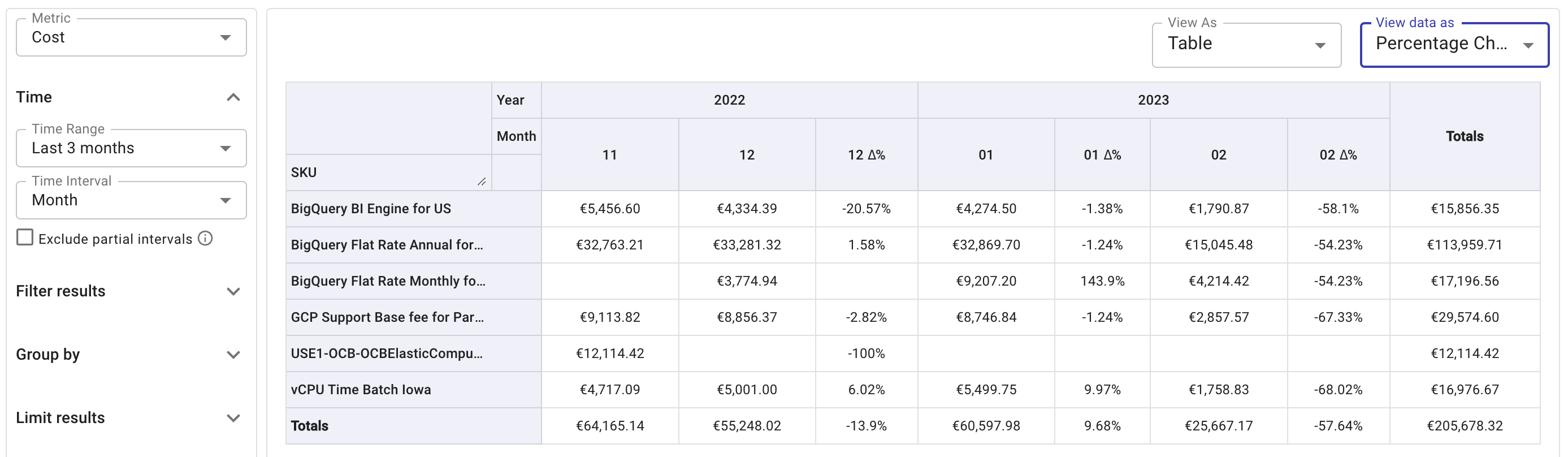
View data as (Comparative report)
A comparative report shows % change or actual difference between two time intervals.
To view a comparative report:
-
Enter the Edit mode of the report.
-
Select an option from the View data as dropdown list:
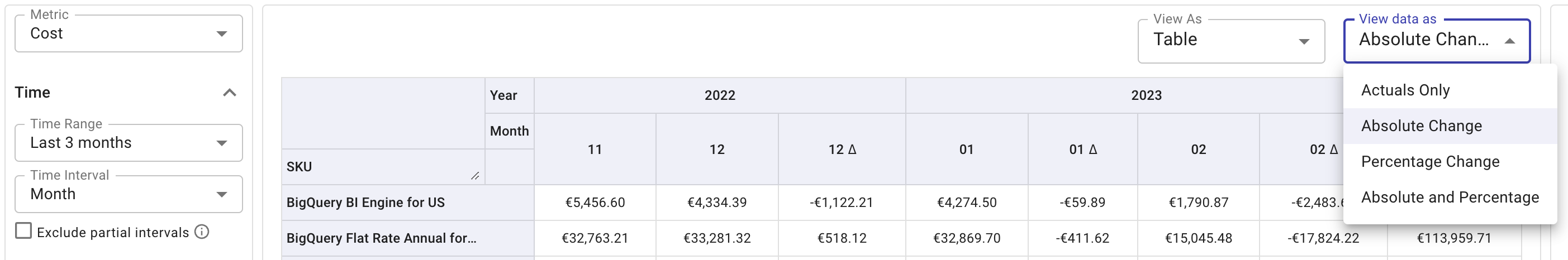
-
When being prompted, select Show report to allow the DoiT Platform to make adjustments necessary to enable the Comparative Report mode, including disabling remaining results aggregation.
-
Once enabled, you will see new columns in your table view showing the Δ between time intervals. This difference (Δ) appears after the intervals compared.
In the example below, there are new columns in the report showing the Percentage Change (Δ%) between time intervals. The percentage change between months 11 (November) and 12 (December) is shown in the column 12 Δ%.