Executive pulse
The Executive pulse dashboard provides an at-a-glance view of your cloud spend across cloud providers.
Required permission
To access the Executive pulse dashboard, your DoiT account needs the Cloud Analytics User permission.
Dashboards access control
Access Executive pulse dashboard
To access the Executive pulse dashboard, select Dashboard from the top navigation mega menu, and then select Executive pulse.
The dashboard contains two parts: three summary cards and a group of preset report widgets.
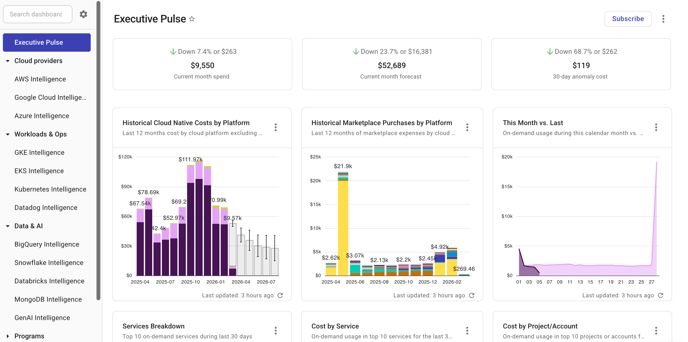
Summary cards
The three summary cards show high-level cloud spend patterns, including the amount of cost and the trend.
| Item | Current month spend | Current month forecast | 30-day anomaly cost |
|---|---|---|---|
| Cost amount | Total cost of the current calendar month. | The ML forecast for your cloud spend by the end of the current calendar month. | The cost generated by anomalies (with severity level >= Warning) in the last 30 days. |
| Trend | How the spend of the current month compares with that of the same period in the previous month. | How the current month forecast compares with the previous month's actual spend. | How the cost of anomalies in the last 30 days compares with that in the same period before that. |
In normal circumstances, the summary cards are updated every 12 hours.
You can click the cost amount on a summary card for more information. For example, clicking the cost amount of Current month spend will open a report that shows your cost in the last 30 days; clicking the amount of 30-day anomaly cost will open the Cost anomalies page.
Preset report widgets
The preset report widgets on the dashboard leverage different dimensions to highlight various aspects of your cloud spend.
Widgets on the dashboard are updated independently of each other. See Refresh report data for more information.
You can Open full report to check the report configuration or customize the preset report to create your own one.
Historical Cloud Native Costs by Platform
The Historical Cloud Native Costs by Platform widget provides an aggregated view of your costs in the last 12 months by cloud platform, excluding Marketplace expenses and promotional credits.
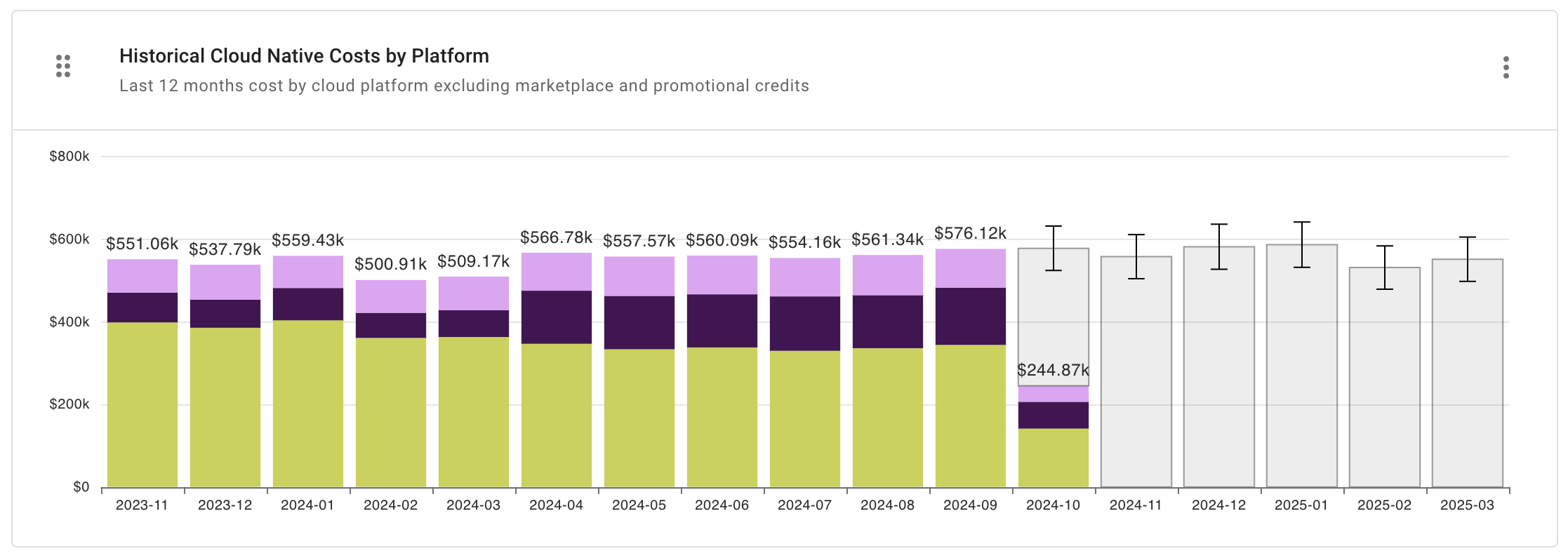
Report configuration:
- Metric: Cost
- Time Range: Last 12 months (include current month)
- Time Interval: Month
- Filter results:
- Cost Type is not
CreditorCredit Adjustment - Credit not matches regexp
(?i)\s*GFS\s* - Marketplace equals
false
- Cost Type is not
- Group by: Provider
- Limit results:
- Limit by value: Cost not between -US$0.10 AND US$0.10
- Advanced Options:
- Advanced Analysis: Forecast
Historical Marketplace Purchases by Platform
The Historical Marketplace Purchases by Platform widget shows your Marketplace expenses in the last 12 months.
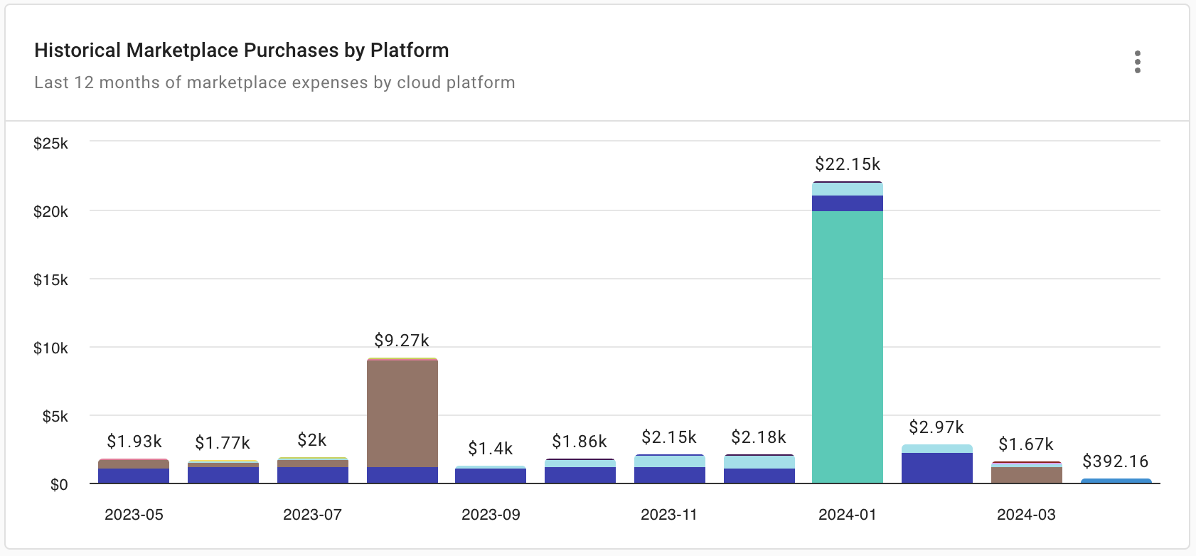
Report configuration:
- Metric: Cost
- Time Range: Last 12 months (include current month)
- Time Interval: Month
- Filter results:
- Cost Type is not
CreditorCredit Adjustment - Credit not matches regexp
^GFS Cloud - Marketplace equals
true
- Cost Type is not
- Group by: Provider, Service
- Limit results:
- Limit by value: Cost not between -US$0.10 AND US$0.10
- Limit by top/bottom: Service—Limit to top 10 by cost
This Month vs. Last
The This Month vs. Last widget shows daily cost comparison between the current and the previous month.
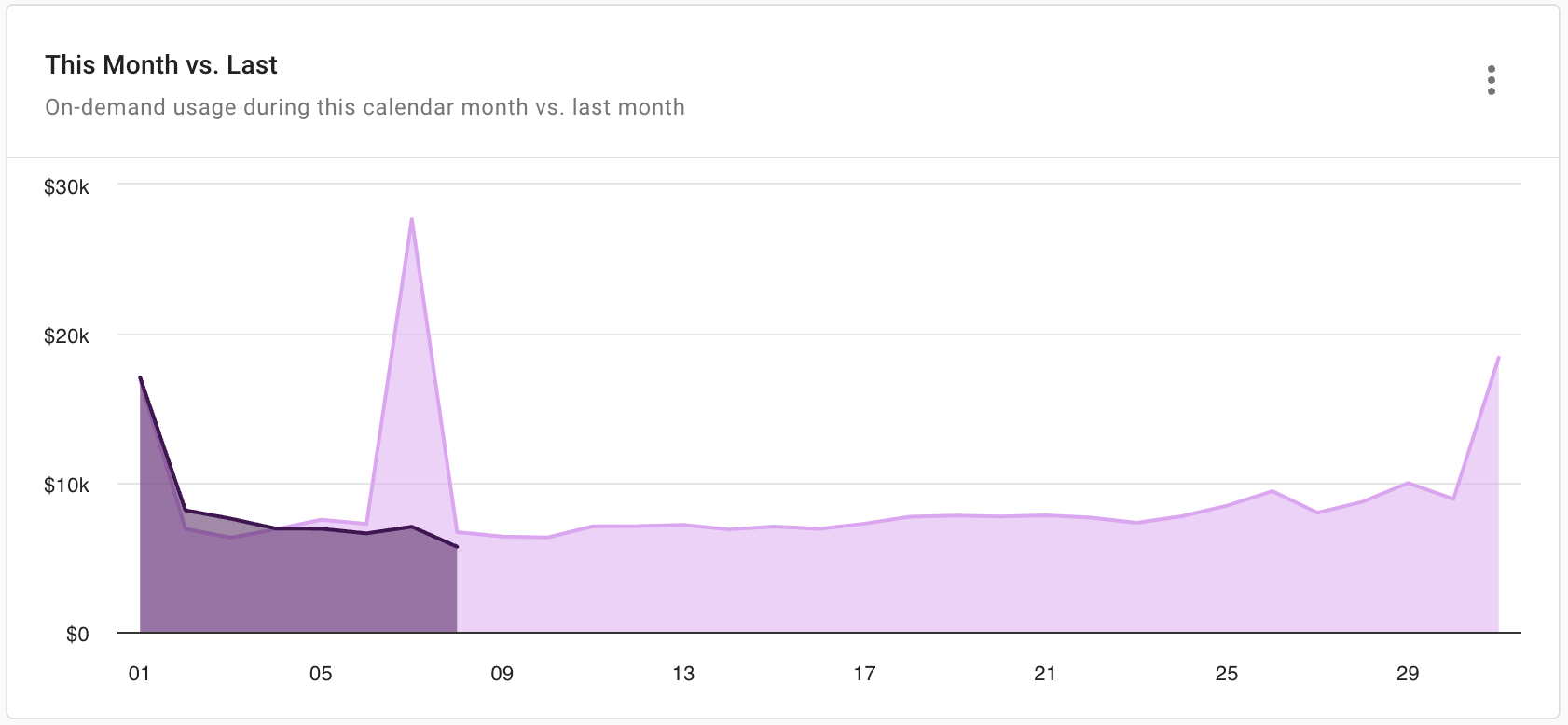
One-off purchases (SPs, RIs, CUDs) are included to reflect periodic reservation impacts, while Credits are excluded because they are usually a result of migration agreements and other non-repeatable situations.
Report configuration:
- Metric: Cost
- Time Range: Last month to date
- Time Interval: Day
- Exclude partial intervals: Yes
- Filter results:
- Cost Type is not
CreditorCredit Adjustment - Credit not matches regexp
^GFS Cloud
- Cost Type is not
- Group by: Year, Month
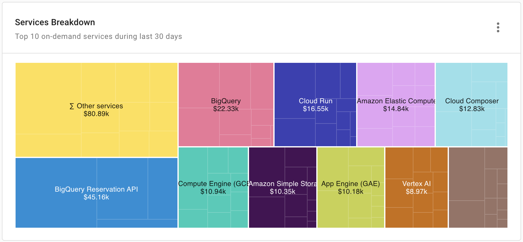
Services Breakdown
The Services Breakdown widget shows the top 10 services by cost in the last 30 days. It also allows you to drill down to each service's top 10 SKUs by cost. You can use this widget to identify improvement opportunities according to the infrastructure load revealed by the report.
Report configuration:
- Metric: Cost
- Time Range: Last 30 days (include current day)
- Time Interval: Day
- Filter results:
- Cost Type is not
CreditorCredit Adjustment - Credit not matches regexp
^GFS Cloud
- Cost Type is not
- Group by: Service, SKU
- Limit results:
- Limit by value: Cost not between -US$1.00 AND US$1.00
- Limit by top/bottom: Service—Limit to top 10 by cost; SKU—Limit to top 10 by cost
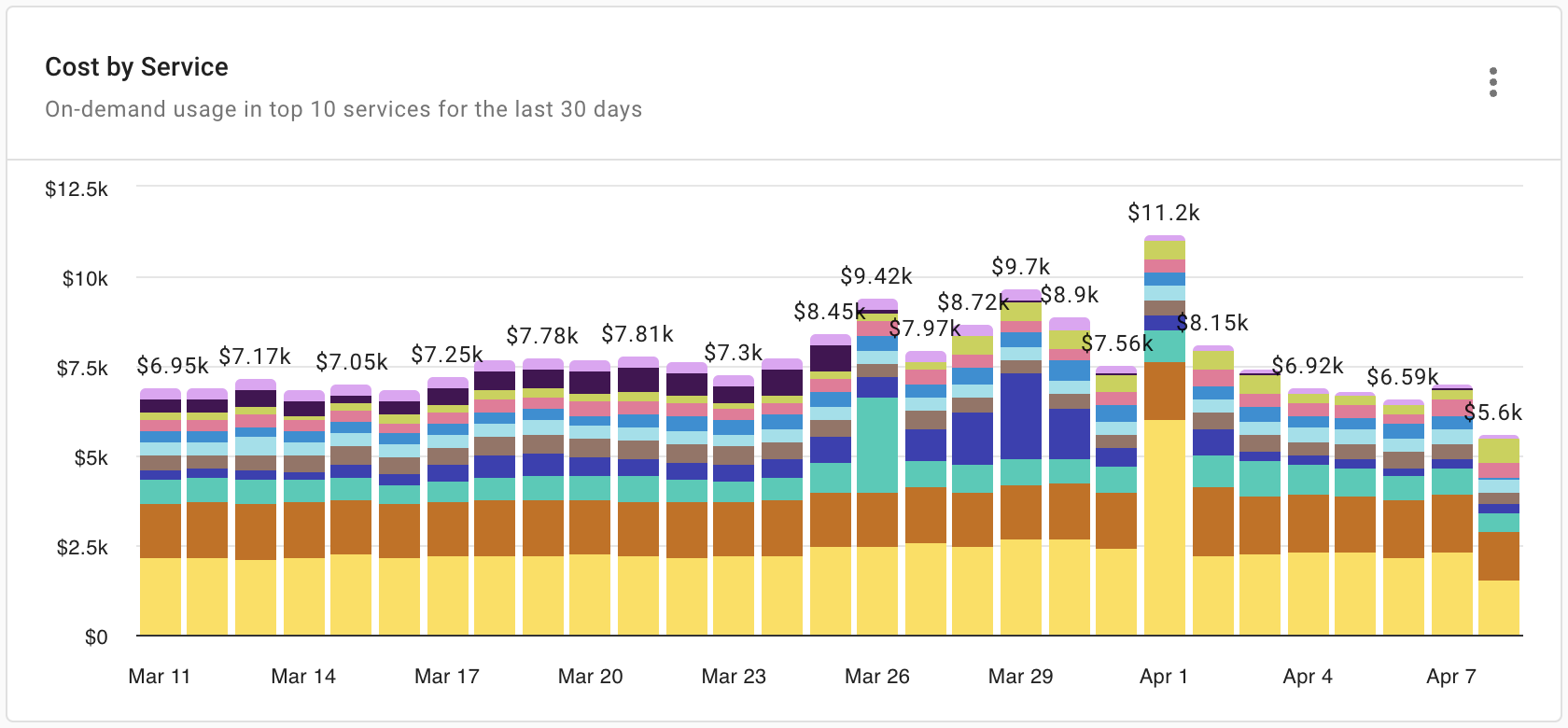
Cost by Service
The Cost by Service widget shows the top 10 services by cost in the last 30 days. It allows you to quickly identify the usage patterns of certain services and notice unusual costs that you may want to investigate.
Report configuration:
- Metric: Cost
- Time Range: Last 30 days (include current day)
- Time Interval: Day
- Filter results:
- Allocation rule is not
AWS RIs, SPsorAWS Support - Cost Type is not
CreditorCredit Adjustment
- Allocation rule is not
- Group by: Service
- Limit results:
- Limit by value: Cost not between -US$1.00 AND US$1.00
- Limit by top/bottom: Service—Limit to top 10 by cost
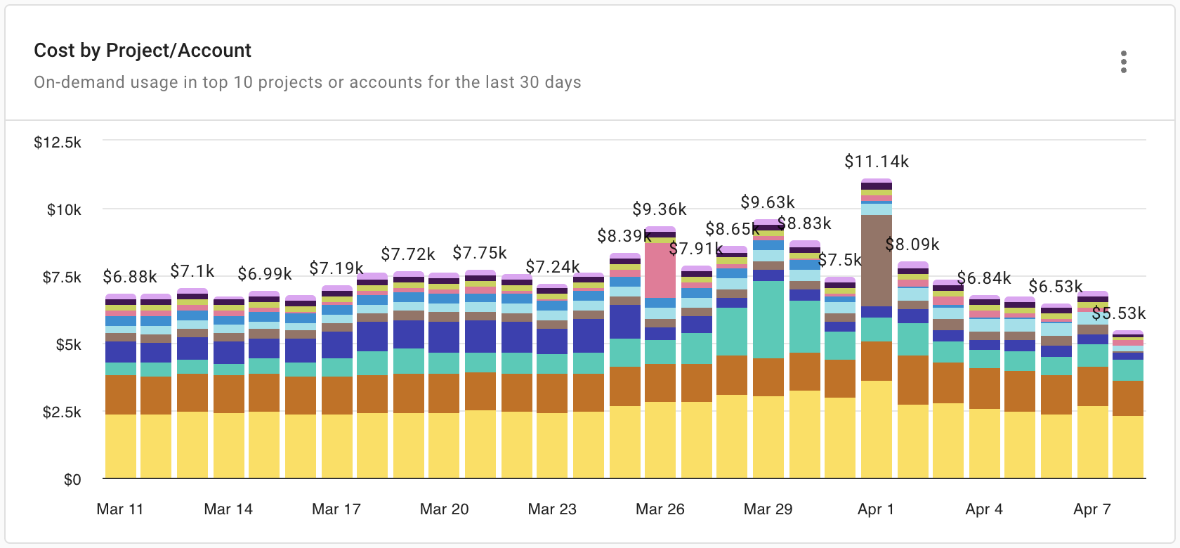
Cost by Project/Account
The Cost by Project/Account widget shows the top 10 Google Cloud projects, AWS accounts, or Azure accounts by cost in the last 30 days. It allows you to quickly identify the activity patterns in your top accounts/projects and notice unusual costs that you may want to investigate.
Report configuration:
- Metric: Cost
- Time Range: Last 30 days (include current day)
- Time Interval: Day
- Filter results:
- Allocation rule is not
AWS RIs, SPsorAWS Support - Cost Type is not
CreditorCredit Adjustment
- Allocation rule is not
- Group by: Project/Account ID
- Limit results:
- Limit by value: Cost not between -US$1.00 AND US$1.00
- Limit by top/bottom: Project/Account ID—Limit to top 10 by cost
Trending Services
The Trending Services widget shows services identified by our ML algorithms as trending (either trending up or down) in the last 60 days. It allows you to quickly identify services that are likely to get out of control and specific SKUs to which you may want to pay more attention.
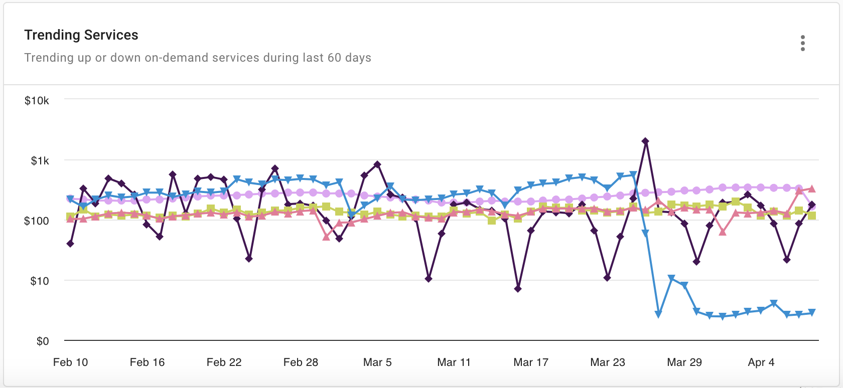
Report configuration:
- Metric: Cost
- Time Range: Last 60 days (include current day)
- Time Interval: Day
- Exclude partial intervals: Yes
- Filter results:
- Allocation rule is not
AWS RIs, SPsorAWS Support - Cost Type is not
CreditorCredit Adjustment
- Allocation rule is not
- Group by: SKU, Service
- Limit results:
- Limit by value: Cost not between -US$1.00 AND US$1.00
- Limit by top/bottom: SKU—Limit to top 10 by cost
- Advanced Options:
- Advanced Analysis: Trending Up, Trending Down
FAQ
Why the total cost in the Historical Cloud Native Costs by Platform widget doesn't match the sum from the Cost by Service widget?
The widgets on the dashboard use different sets of filters. They do not match by default.
For example, the Cost by Service widget doesn't include AWS Support and RIs and SPs costs, while these costs are included in the Historical Cloud Native Costs by Platform widget. In addition, the Cost by Service widget shows only the top 10 services by cost, potentially leaving out significant spend.
You can create new reports of your own to include items of interest and add them to custom dashboards if necessary.
Why the total cost shown in CloudHealth doesn't match that in the DoiT console?
The total cost in CloudHealth can't be compared with that in the DoiT console, especially not in a live view; there are a number of factors that effect the breakdown and the total costs.
-
CloudHealth and DoiT console ingest and process data at different times (in general the DoiT console fetches data more frequently and spends less time to process it).
-
The impact of Flexsave on the bill is not visualized in CloudHealth.
-
Promotional credits are reflected in the DoiT console totals but not included in CloudHealth.
If you have questions regarding the differences, please open an expert inquiry.