ダッシュボードウィジェット
CloudFlow ウィジェットを使用すると、CloudFlow ステップと Datastore テーブルのデータを DoiT コンソールのダッシュボード上に直接表示できます。任意のダッシュボードに複数のウィジェットを追加でき、それぞれ異なるデータソースに接続し、独自のビジュアライゼーションを設定できます。
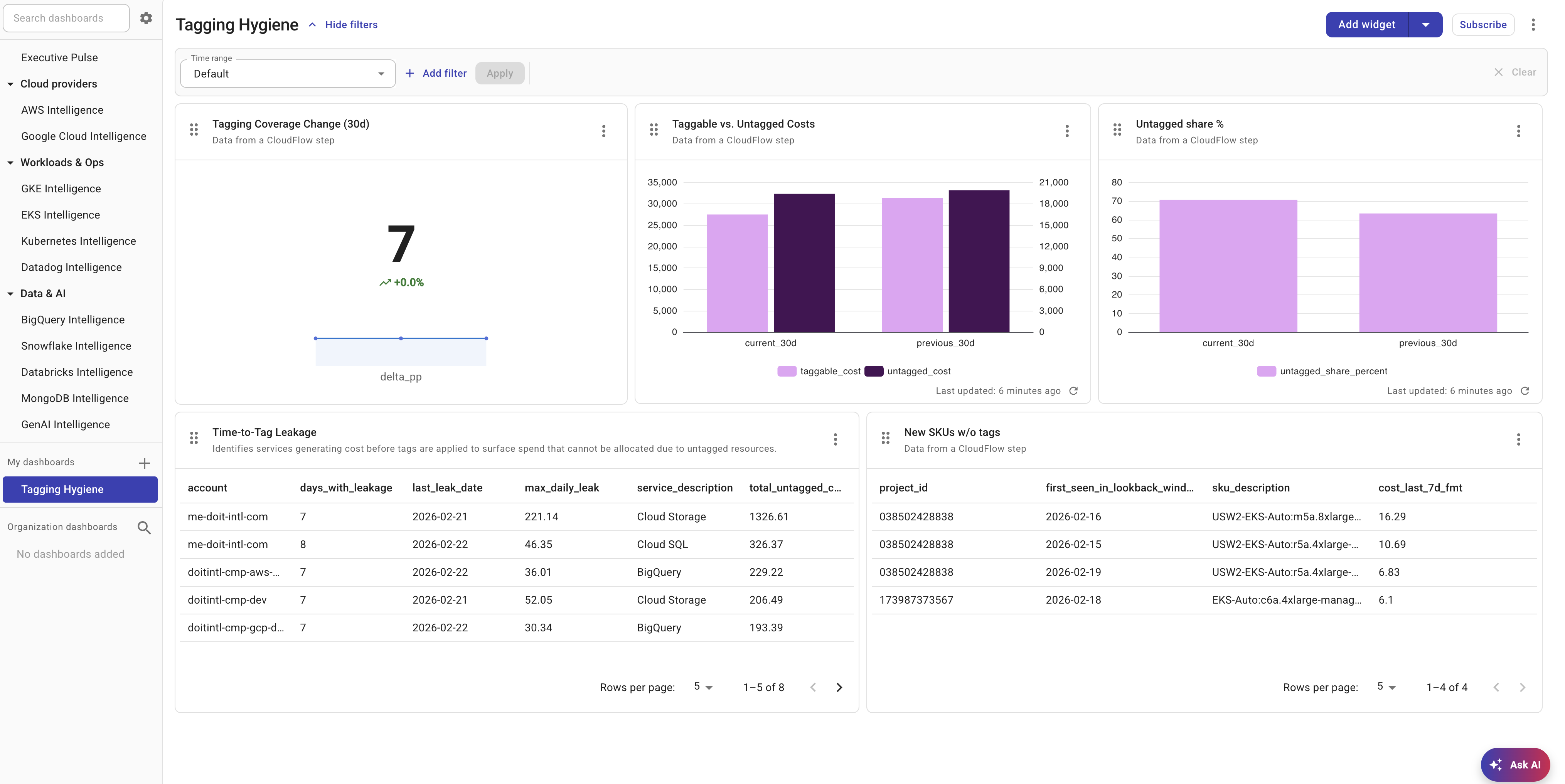
CloudFlow ウィジェットを追加する
-
DoiT コンソールにサインインし、Dashboards に移動して、編集したいダッシュボードを開いてください。
-
Add widget を選択し、ウィジェット一覧から CloudFlow を選択してください。
-
新しい CloudFlow ウィジェットがダッシュボードに追加されます。ウィジェット上の三点メニュー(⋮)を選択し、Configure を選択して設定してください。
データソース
各ウィジェットは、次の 2 種類のデータソースのいずれかに接続します。
-
Flow Step — フローと、そのフロー内のステップ、およびデータ パスを選択します。ウィジェットには、選択したフローの直近の正常終了時のデータが表示されます。
-
Datastore table — Datastore テーブルを選択します。ウィジェットには、そのテーブルの現在のレコードが表示されます。
Flow Step の設定
ソースとして Flow Step を選択した場合:
-
利用可能なフローの一覧から Flow を選択してください。
-
Step(ノード)を選択してください。ステップは実行順に一覧表示されます。
-
Data Path を選択してください。データ パスはステップの出力から自動検出され、実行結果内で見つかったオブジェクト配列を表します。
選択したフローは、データ パスを利用できるようにするために、少なくとも 1 回は実行されている必要があります。まだ一度も実行されていないフローは、先に実行してください。
Datastore テーブルの設定
ソースとして Datastore table を選択した場合は、ドロップダウンからテーブルを選択してください。ウィジェットには、そのテーブルのすべてのレコードが表示されます。
表示タイプ
データソースを選択したら、データのビジュアライゼーション方法を選択します。
Table
ソート可能なデータグリッドとしてデータを表示します。表示するカラムを任意で選択でき、デフォルトのソートフィールドと方向を設定できます。
Column chart
縦方向のバーチャートを描画します。設定内容:
- X-axis — カテゴリとして使用するフィールド
- Y-axis fields — 左右の軸に割り当てる 1 つ以上の数値フィールド
- Group by(任意)— グループ化されたバーを作成するためのフィールド
Stacked column chart
Column chart と同じ設定ですが、バーが横並びではなく積み上げ表示されます。
Line chart
トレンドラインを描画します。軸の設定は Column chart と同じです。
Column and line(コンボ)
同じチャート上にバーとラインの系列を組み合わせて表示します。各 Y 軸フィールドは、バーとラインを切り替えることができます。
Metric
集計された単一の値を目立つ形で表示します。設定内容:
- Metric field — 集計対象のフィールド
- Aggregation — 値の算出方法(Sum・Average・Min・Max・Count・Last)
- Metric prefix(任意)—
$や€など、表示値の前に付ける文字列
データソースが Flow Step の場合、Metric ウィジェットには次の情報も表示されます。
- sparkline — 直近の実行に基づく小さなトレンドライン
- percentage change インジケーター — 前回の実行からの変化を示す上下の矢印
ウィジェット名を変更する
デフォルトでは、ウィジェットのタイトルはデータソースに基づいています(例:"Data from SQL")。タイトルを変更するには:
-
ウィジェット上の三点メニュー(⋮)を選択してください。
-
Rename を選択し、新しいタイトルを入力してください。
データを更新する
ウィジェットには、直近の実行またはテーブルの更新時刻に基づく「Last updated」タイムスタンプが表示されます。手動で更新するには:
-
ウィジェット上の三点メニュー(⋮)を選択してください。
-
Refresh を選択してください。
ウィジェットを削除する
-
ウィジェット上の三点メニュー(⋮)を選択してください。
-
Remove を選択してください。