View costs
Cloud Diagrams expose cost-related information for individual diagrams:
-
Whole diagram (account or project): A costs heatmap, cost summary, cost anomalies, alerts, and FinOps insights.
-
Single component: A cost summary and cost anomalies.
You can also use Ava to control the cost overlay and answer cost questions using natural language. For example, ask Ava to turn on the cost heatmap, change the time range, or report your total spend directly from the diagram view.
The Costs layer is available for individual diagrams only and is not available for the global network layer.
Required permissions
To use Cloud Diagrams, your DoiT account must have the Cloud Diagram User permission.
View costs for a diagram
You can view your cloud infrastructure costs on a diagram. Instead of searching through reports or different areas of your system, you have an immediate, contextual view of your infrastructure spend in one place. This is useful for optimizing costs, troubleshooting unexpected cost spikes, and facilitating clearer communication within teams.
View costs as a heatmap
The costs heatmap enables you to quickly identify your most expensive resources during the specified time range.
-
From the dashboard, select a diagram.
-
In the sidebar, under Layers, select Costs. The default time range is 28 days with an interval of week.
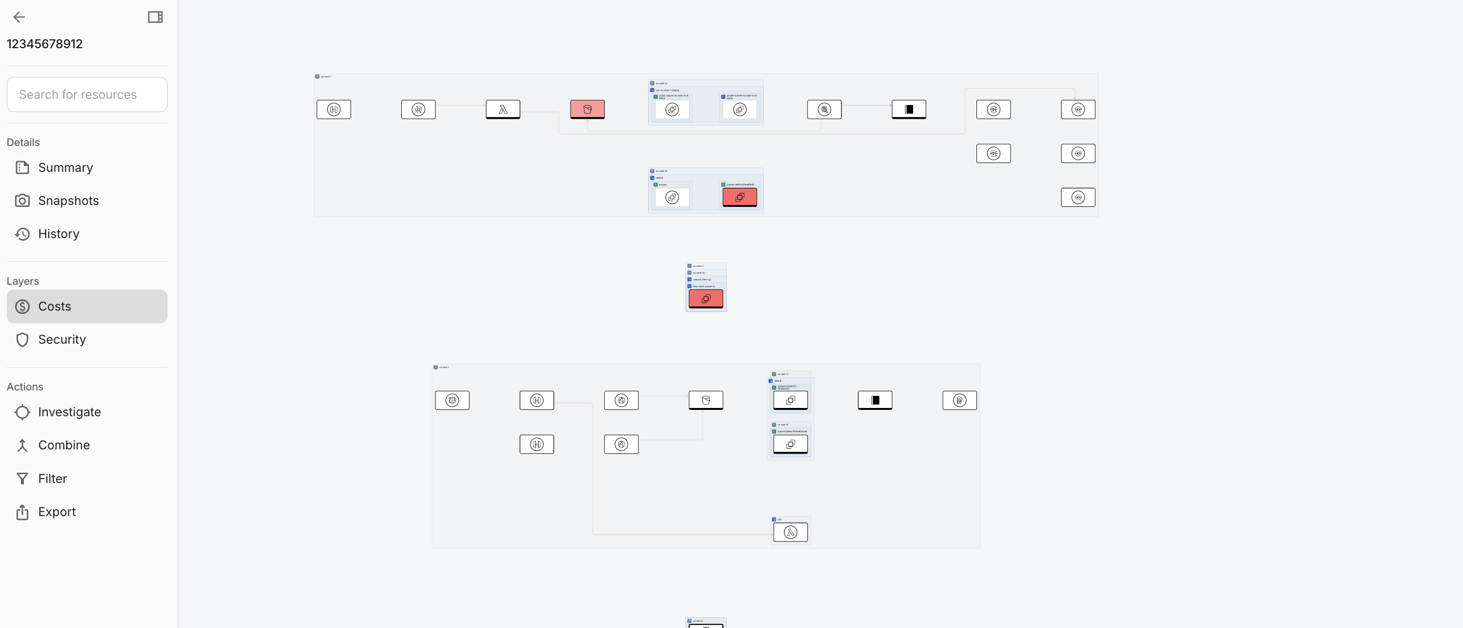
You can amend the time range with the pencil icon in Costs. When the heatmap finishes loading, Costs summary opens in the side panel.
View cost summary
The Costs tab in Costs summary rolls up spend for an entire account or project. The Costs tab provides the total spend over your selected timeframe, showing daily trends and a breakdown by service, SKU, or other dimensions. By pairing these totals with your diagram, you keep the financial data and the infrastructure logic in one place. This makes it much easier to sanity-check bills, compare different periods, and brief stakeholders without needing a separate report for every question.
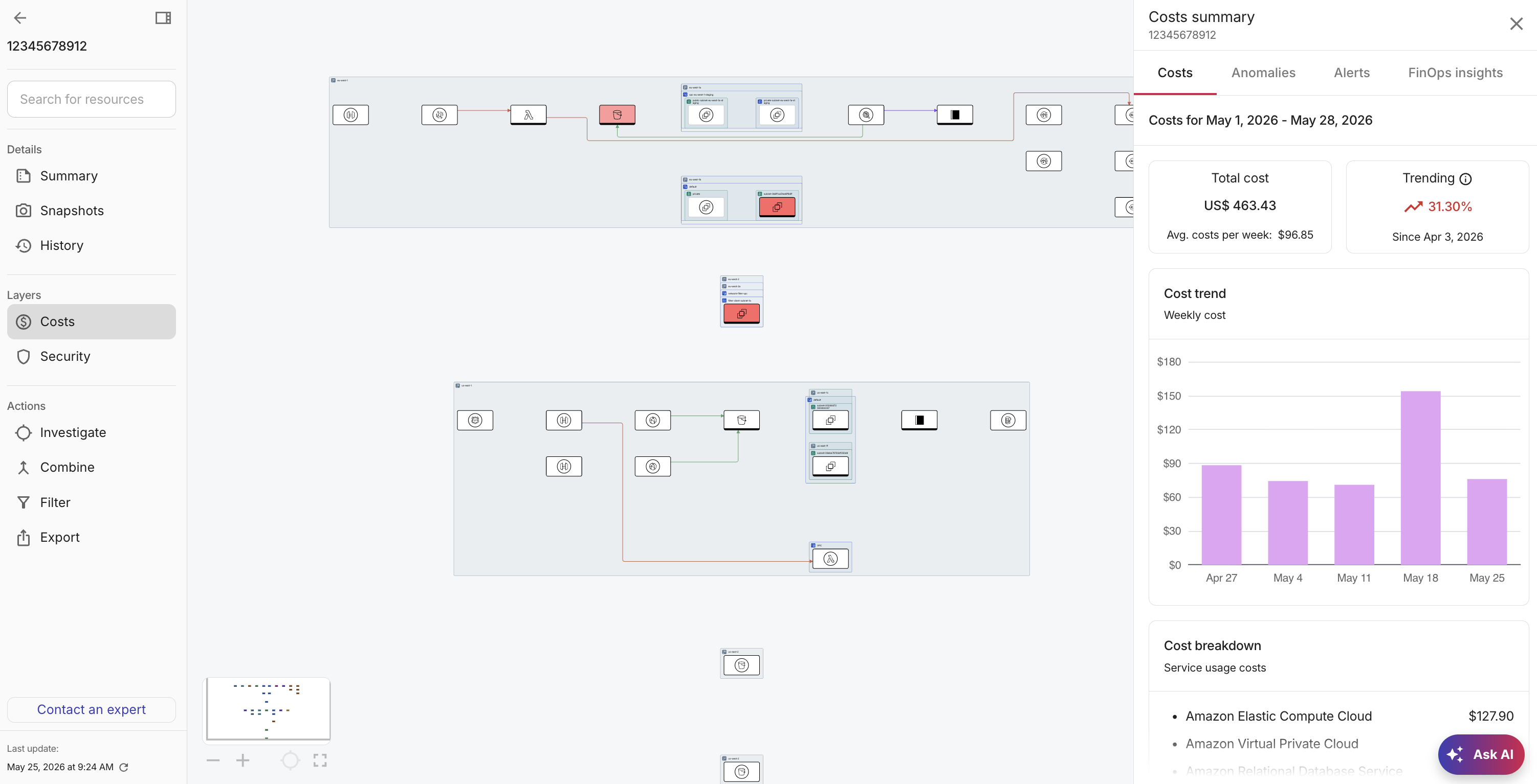
The Costs tab includes the following:
-
A time range and interval so you can see your total and trending spend over a specific period. By default, the time range is the last 28 days with an interval of week. Use the pencil icon on Costs to change the time range and interval.
-
Cost trend: Use Cost trend to see a day-by-day view of how costs are accumulating for this account or project.
-
Costs breakdown: Use the Cost breakdown to see a list of costs for this account or project. The information changes depending on what you are viewing. For example, you might see a list of services or SKUs.
View cost anomalies
Cost anomalies are spend patterns that look unusual compared to your recent baseline, for example, a service or SKU outside its normal range. Instead of waiting to see a cost anomaly on a monthly invoice, viewing it directly on your diagram allows for immediate triage, making it faster to investigate and communicate the root cause of the spike.
The Anomalies tab includes the following:
-
Sort by most recent, important, or expensive.
-
Filter by active and inactive anomalies.
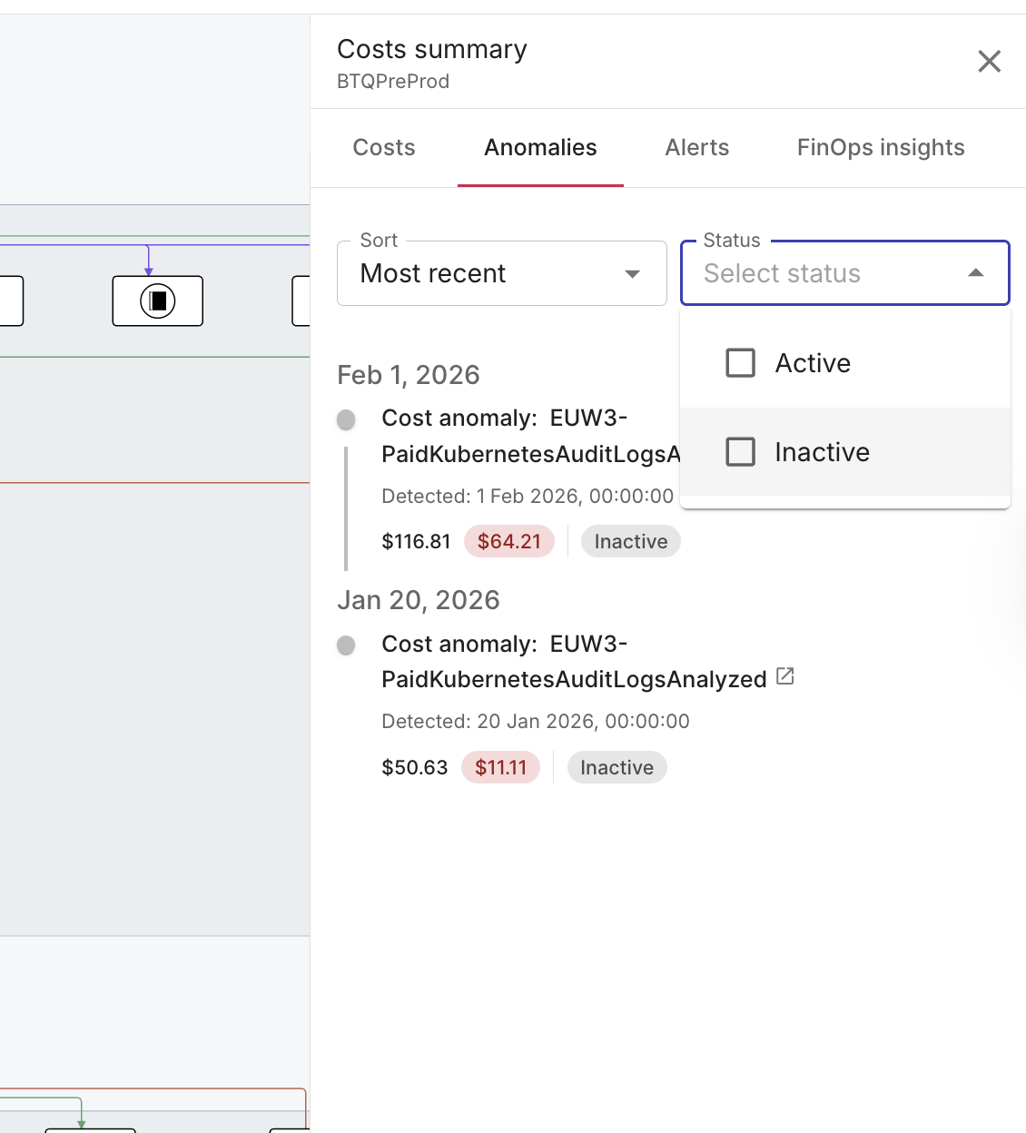
For each anomaly you see status, acknowledgement, and affected resources. Hover for a summary, select an affected resource to focus the diagram, or select the title to open anomaly details in the DoiT console.
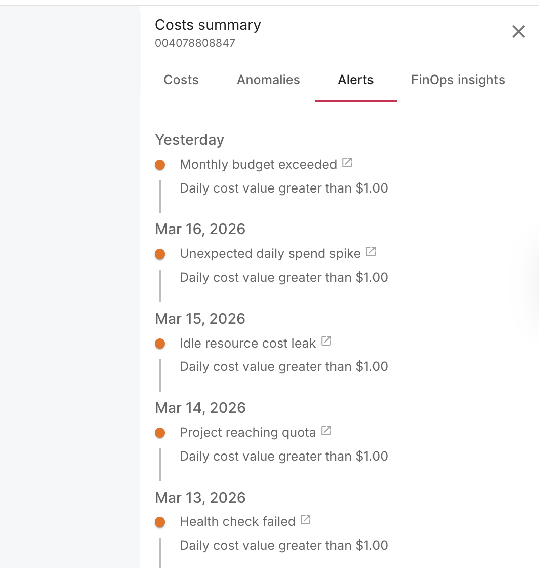
View alerts
Alerts (such as budget and other alerts you configure) happen when conditions you care about are met, for example, thresholds crossed, limits approached, and so on. Alerts are displayed in time order for the diagram's account or project. This makes it easier, for example, to connect a policy breach with its specific location in your architecture and the exact time it occurred, allowing for faster follow-up and clearer handoffs between teams.
The Alerts tab includes a timeline for the diagram. Each row includes the alert time, name, condition, and optional breakdown.
-
Select an alert to view it in DoiT Cloud Intelligence.
-
No alerts found for this diagram means there are no alerts configured for the linked account or project, or no alerts have been triggered for this diagram yet.
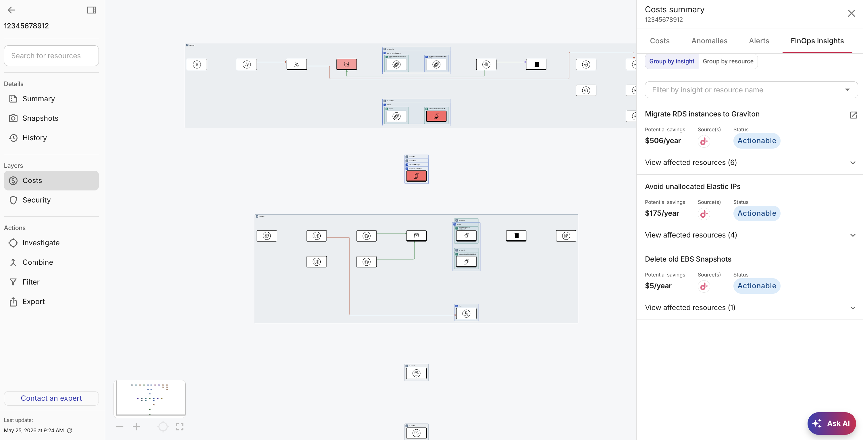
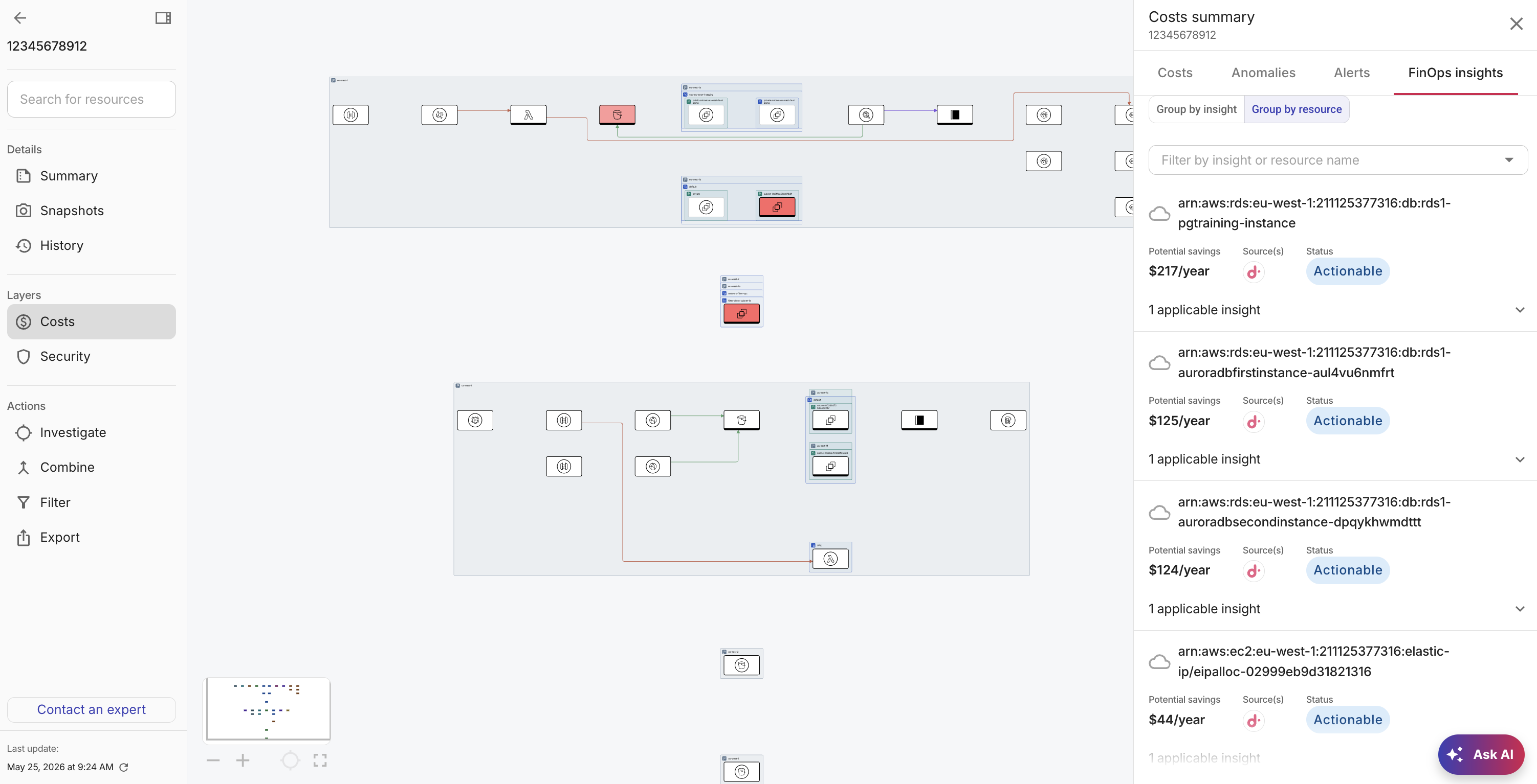
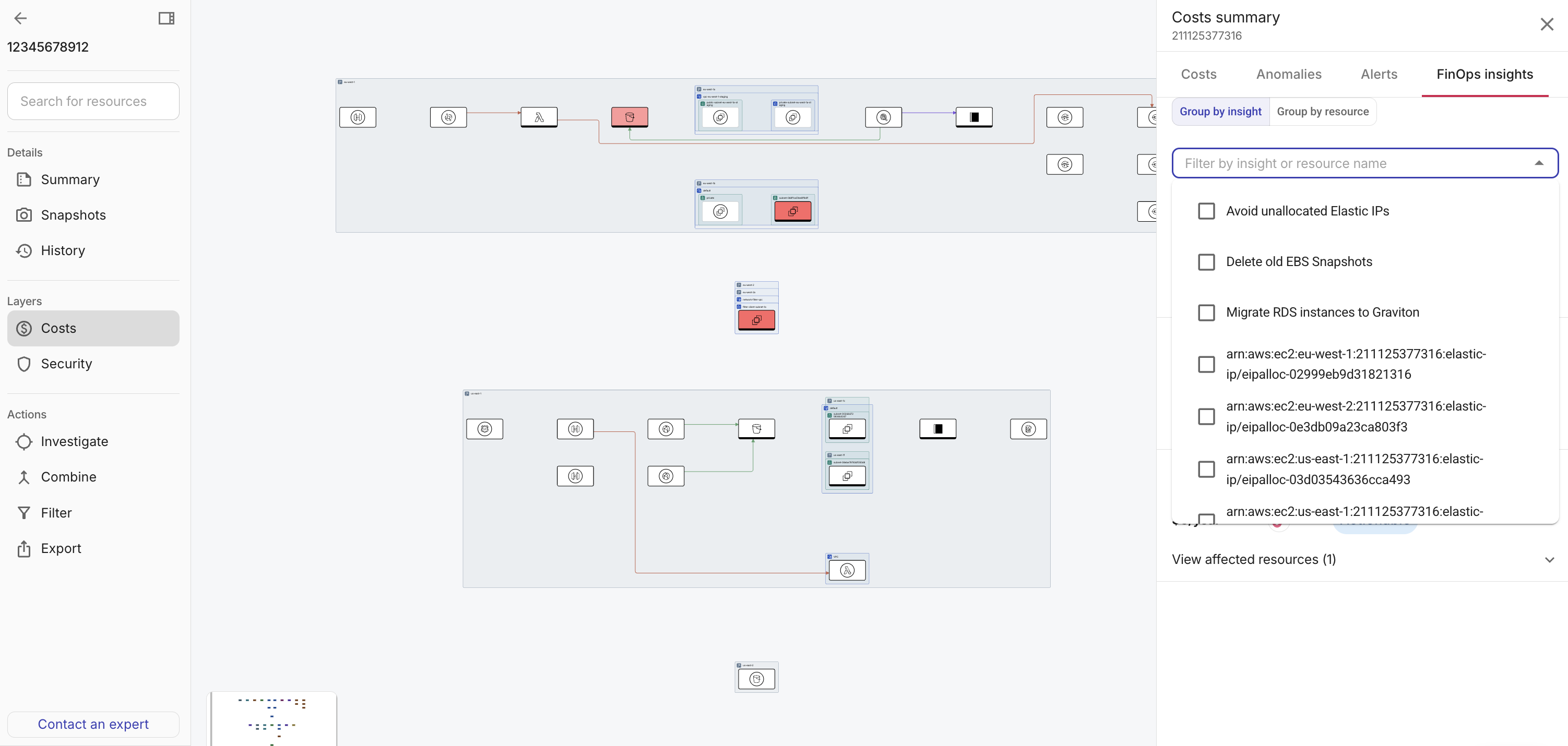
View FinOps insights
FinOps insights surface actionable cost optimizations for resources that appear on your diagram, such as rightsizing, idle or underused assets, and similar recommendations from DoiT Insights. Generic savings reports are often ignored because they lack architectural context. By surfacing insights directly on the diagram, you can instantly see which nodes a recommendation affects and how it impacts any surrounding dependencies. This bridges the gap between identifying potential savings and knowing exactly what to change. In large, constantly evolving cloud environments, having this level of precision is critical to staying on top of your spend.
The FinOps insights tab lists recommendations for resources on your diagram. For each insight, you see its potential savings, source, and status.
-
Use Group by insight to organize the list by recommendation type. Expand an insight to see every affected resource. This is useful when you want to address one kind of optimization, for example, rightsizing or idle resources, across many nodes at once.
-
Use Group by resource to organize by cloud resource. Open a resource to see all insights that apply to it. Expand an insight to see every affected resource. This view is useful when you are focused on one component and want every savings opportunity for that asset.
-
Use Filter by insight or resource name to narrow the list. Pick one or more insight titles or resource names so only matching rows stay visible. Expand an insight to see every affected resource. This is useful when the diagram is large and you already know what you are looking for.
-
Select an insight or resource in the list to highlight the related components on the diagram. Use Back or leave the view to clear the highlight.
-
Expand an insight to see a list of affected resources.
-
An empty list may mean no matching recommendations for this diagram yet, or FinOps insights are not available in your environment.
For a single component
The Costs and Anomalies tabs provide the same details found in cost summary for the account or project and cost anomalies for the whole diagram, including totals, trend, breakdown, and anomaly lists, but filtered specifically to the selected component.
Select a component on the diagram, then use the component side panel.
View costs
-
Select a component on the diagram.
-
Open the Costs tab.
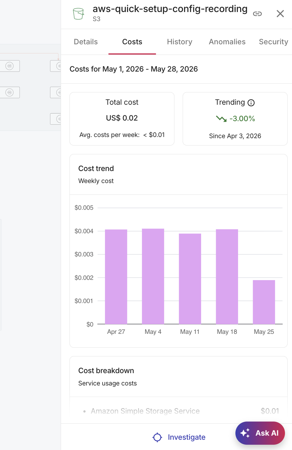
Set time range and interval (default last 28 days, weekly interval). See Cost trend and Costs breakdown specific to the selected component.
NoteIf the costs heatmap is on, this tab may share the heatmap time range until you change it.
View cost anomalies
-
Select a component on a diagram where you want to inspect cost anomalies.
-
Select the Anomalies tab.
-
Sort by most recent, important, or expensive.
-
Filter by active and inactive anomalies.
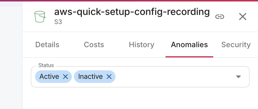
For each anomaly you see status, acknowledgement, and affected resources. Hover for a summary, select an affected resource to focus the diagram, or select the title to open anomaly details in the DoiT console.
-