Models
The Models page in AI Hub breaks down your billed GenAI spend and token usage by model and model family. Use this view to identify which models drive your AI spend and how costs change over time.
To open the Models page, go to Tokenomics > Model in the AI Hub sidebar.
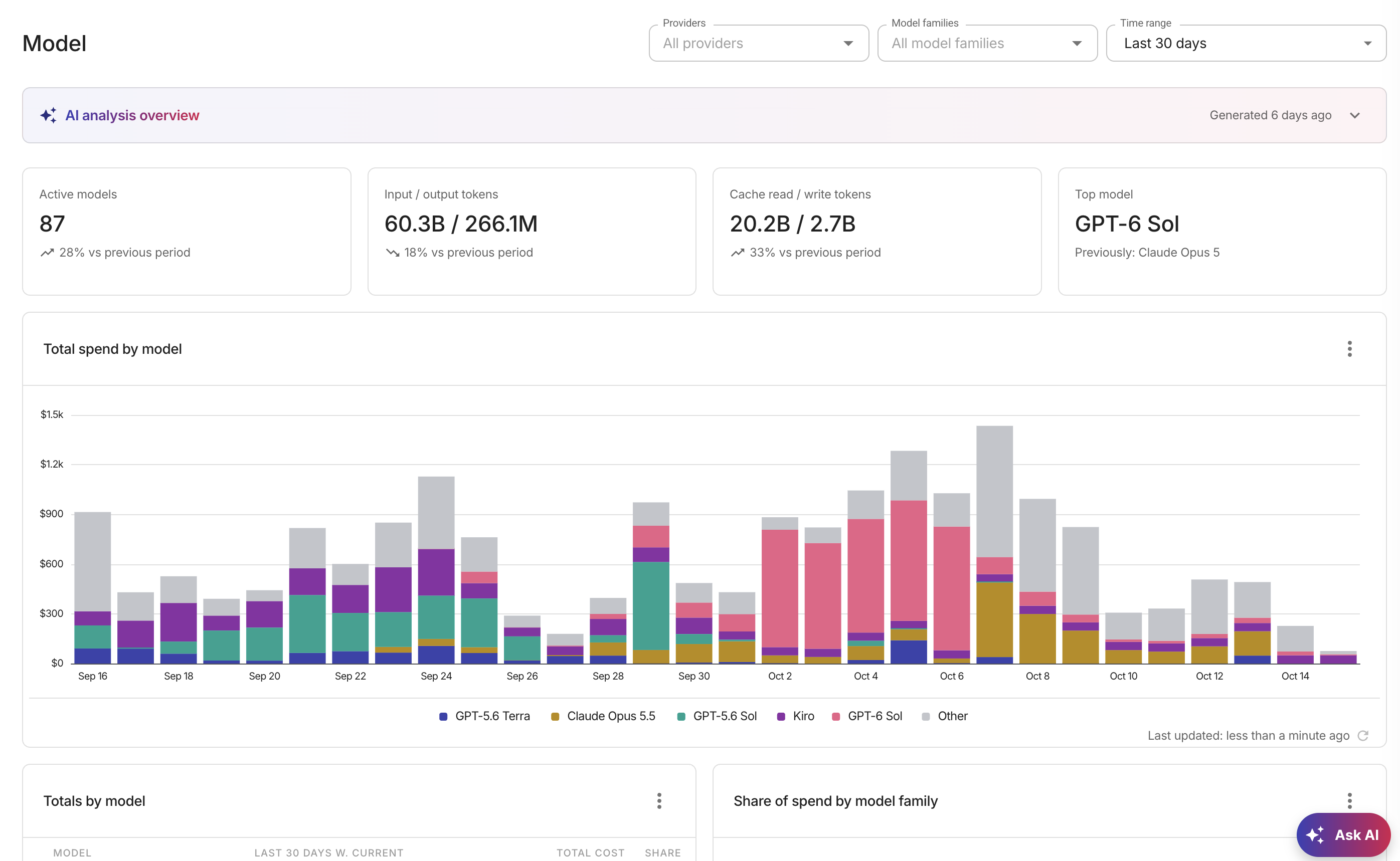
KPI cards
Four KPI cards at the top of the page summarize your AI model usage for the selected time range. The cards reflect any provider and model family filters applied on the page.
-
Active models: The number of distinct billed models in the selected time range, with a trend indicator showing the change compared to the previous period of the same length.
-
Input / output tokens: Total input and output token counts for the selected time range, displayed as a pair. The trend indicator reflects the combined change in input and output tokens compared to the previous period.
-
Cache read / write tokens: Total cache read and cache write token counts for the selected time range, displayed as a pair. The trend indicator reflects the combined change compared to the previous period.
-
Top model: The model with the highest net spend in the selected time range. When no model has positive spend in the window, this card displays None. The card also shows which model was top in the previous period for comparison.
The KPI cards support time ranges of up to 366 days, such as the last 12 months or the current year. If the selected time range exceeds 366 days, the cards display a message asking you to pick a shorter range.
Total spend by model
A stacked column chart of your daily GenAI cost by model for the last 30 complete days. The chart shows the five highest-cost models and groups the rest into Other.
Totals by model
Ranks your models by total GenAI cost for the last 30 days, including today, with each model's share of the total. The card shows the ten highest-cost models and groups the rest into Other.
Share of spend by model family
A pie chart of each model family's share of your GenAI cost for the last 30 days, including today. The chart shows the eight highest-cost model families and groups the rest into Other.
Model spend trends
The Model spend trends board shows each model as a separate tile with its daily cost over the selected time period. Each tile identifies the model name and cloud provider, with a sparkline showing the day-by-day cost trend. The default time range is the last 30 days, including today.
When more models exist than the board can display, a link appears at the bottom showing how many additional models are available. Select it to open the full report in Cloud Analytics, where you can explore all models without a tile limit.
When a model has had no spend for a sustained period, its tile shows a grey Stopped chip with "No spend since" and the date, instead of a percentage change.
Filter the view
The Models page uses the shared AI Hub filter bar. You can narrow the data by:
- Providers: Filter to one or more providers or view all providers.
- Model families: Filter to one or more model families.
- Time range: Select a different time period. The default is Last 30 days.