Benchmarks
The Benchmarks page shows how your FinOps practice compares against anonymized DoiT customers with similar cloud spend and industry. An overall maturity score (0--100) places you in a Crawl, Walk, or Run stage, and a peer distribution histogram shows where you stand relative to your peer group. Category cards break the score down into individual metrics so you can identify specific areas for improvement, a progress card shows how your score has moved month by month, and every number has a panel that shows how it was calculated.
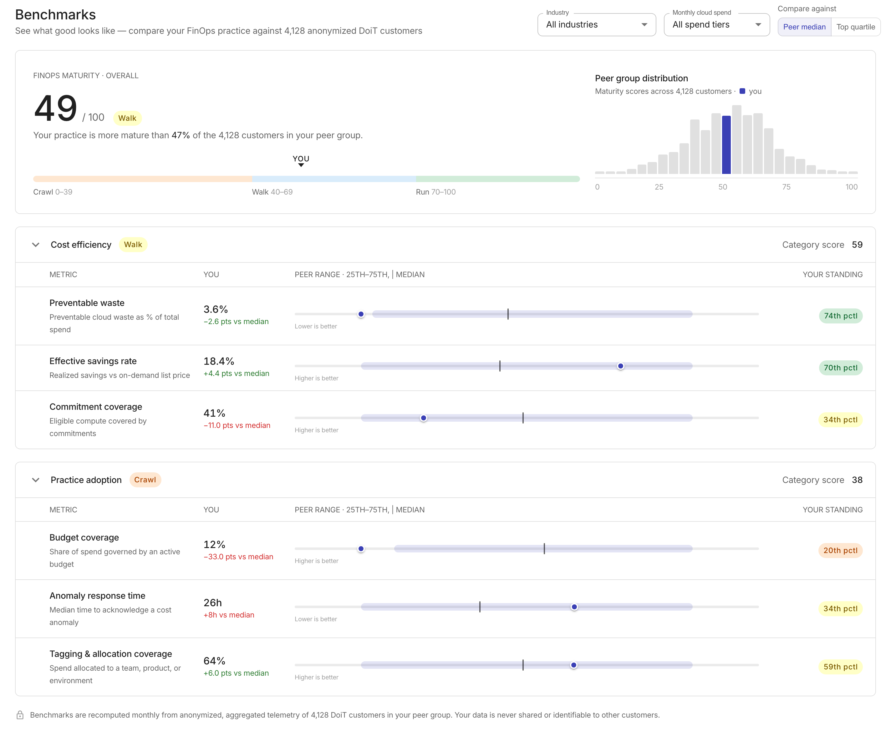
To access Benchmarks, in the DoiT console, go to Reporting and analytics > Benchmarks. Benchmarks are not available to partner-managed accounts.
Peer groups
Your peer group is the set of DoiT customers in the same monthly cloud spend tier and industry as you. Your spend tier comes from your average monthly cloud spend over the last three months.
A peer group is published only when it includes at least 10 customers, and a metric is compared only when at least 10 of them have a value for it. If fewer than 10 customers share both your spend tier and industry, you're compared with a broader group: your spend tier across all industries, then your industry across all spend tiers, then all benchmarked customers. A notice at the top of the page tells you when this happens.
The page subtitle shows how many customers are in the peer group you're viewing and how many DoiT customers are benchmarked in total.
Filters
The page opens with your own peer group selected. Use the controls at the top of the page to compare against a different peer group or change the comparison baseline. All scores, deltas, and the histogram update when you change a filter, and Back to your peer group returns to your own group.
-
Industry: Compare against a specific industry. Options include All industries, Software & SaaS, Financial services, Retail & e-commerce, Media & gaming, Healthcare, and Other industries.
-
Monthly cloud spend: Compare against a spend tier. Options include All spend tiers, Under $50K/mo, $50K--$250K/mo, $250K--$1M/mo, and Over $1M/mo.
Options without enough customers to form a peer group are unavailable. If a combination you select isn't published, the page shows the closest broader group.
-
Compare against: Toggle between Peer median and Top quartile to change the baseline used for metric deltas.
The Your progress card doesn't follow the filters. It always uses the peer group you were assigned each month.
Maturity score
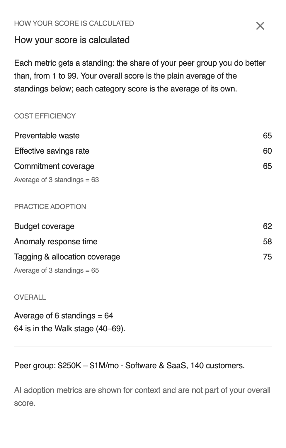
The hero card at the top of the page displays your overall FinOps maturity score on a 0--100 scale. Each metric gets a standing, your percentile rank among your peers with higher always meaning better. Category scores are the average of the standings in that category, and the overall score is the average of all your standings in the Cost efficiency and Practice adoption categories. Metrics without a value don't count toward a score, and AI adoption metrics never count toward the overall score.
A stage pill indicates your current maturity stage:
| Stage | Score range |
|---|---|
| Crawl | 0--39 |
| Walk | 40--69 |
| Run | 70--100 |
A stage bar below the score shows the three stages with a YOU marker indicating your position.
Select the info button next to the score, How your score is calculated, to see every standing that went into it. See Score walkthrough for a worked example.

Peer group distribution
Next to the maturity score, a histogram shows the distribution of maturity scores across the customers in your peer group. Your position is highlighted in the histogram, and a summary line shows what percentage of the customers in your peer group have a lower maturity score than you.
Your progress
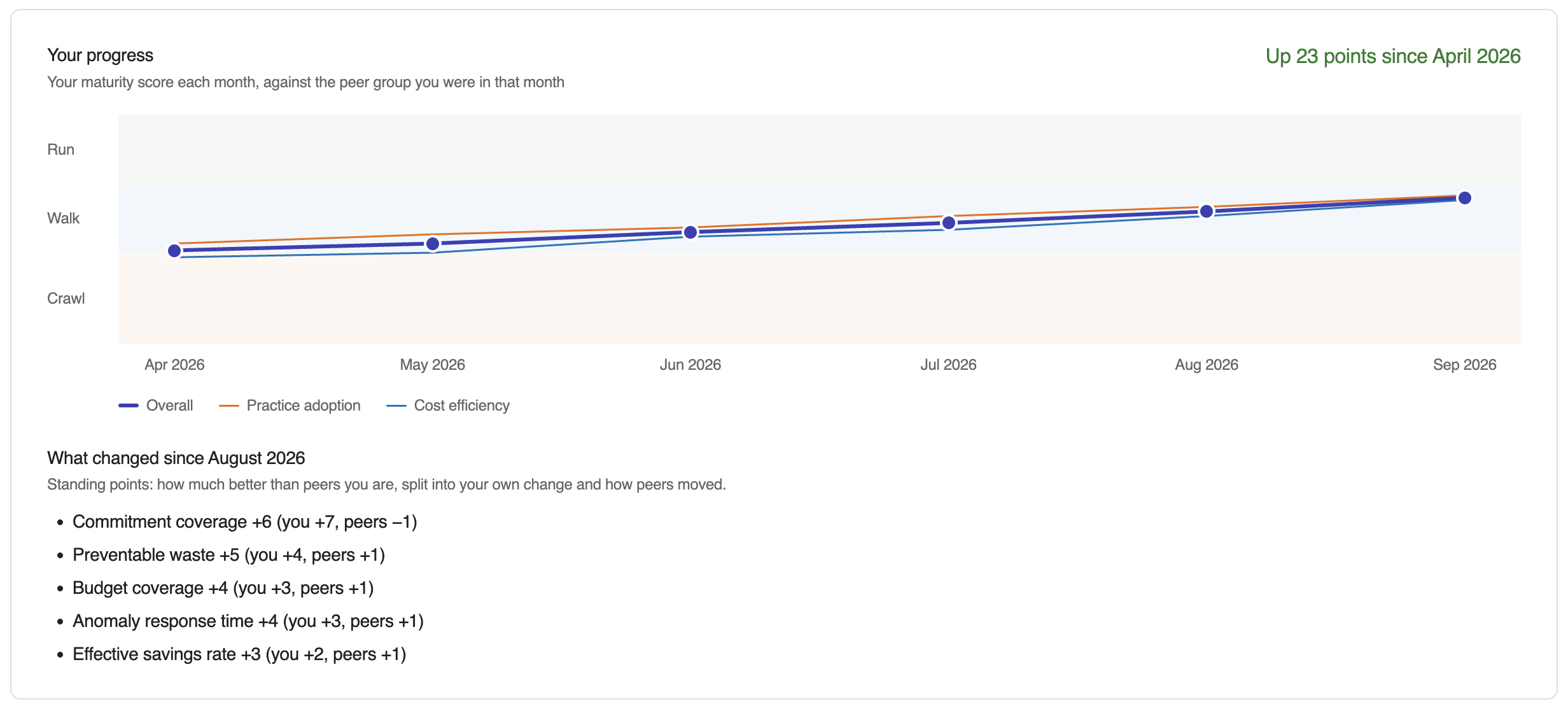
The Your progress card, directly below the maturity score, shows your maturity score each month against the peer group you were in that month.
-
Chart: One point per benchmarked month, oldest on the left, for up to the last 12 months. Lines show your overall score and your Cost efficiency and Practice adoption category scores, over horizontal bands that mark the Crawl (0--39), Walk (40--69), and Run (70--100) stages. Hover over a month to see each score, your stage, and the peer group used.
-
Headline: The change in your overall score between the first and the latest month shown, for example, Up 12 points since September 2026, and your stage change when there is one, for example, Walk → Run.
-
What changed since last month: Up to five metrics whose standing moved by at least one point between the previous month and the latest one, ordered by how much each moved your overall score. Each line splits the standing change into your own change and the peers' change (see Change attribution). A metric that has a standing in only one of the two months is listed as ranked this month, not last month or not ranked this month (no value, or too few peers report it).
Each metric row also shows a small sparkline of your own value for that metric over the same months, next to its direction label. The sparkline appears once a metric has values for at least two months.
History starts with the first month you were benchmarked, and earlier months are never estimated. A month is shown only when it was calculated on schedule, during the month or within a week of its end. Some data, such as commitment coverage and tagging, is only available close to the end of the month, so a month calculated later would be missing metrics and its score couldn't be compared with the others. History therefore starts with September 2026. The same rule applies to the change since last month on the Home page and to Change attribution. With only one benchmarked month, the card shows your score and the note Your progress appears here from next month, once two months are benchmarked.
On the Home page, the benchmarks block shows how much your overall score changed since last month. In the advanced layout, it also shows a small chart of your overall score and a See your progress link that opens this card.
Change attribution
A standing can change because your own value changed, because your peers' values changed, or both. To separate the two, your value for the latest month is also ranked among the peers you had the month before:
-
You: Your standing this month against last month's peers, minus your standing last month. This is the part of the change your own value caused.
-
Peers: Your standing this month minus your standing this month against last month's peers. This is the part caused by peers improving or falling behind, or by customers joining or leaving the group.
For example, Commitment coverage +14 (you +18, peers −4) breaks down as follows:
| Step | Standing |
|---|---|
| Your standing last month | 58 |
| This month's value, ranked among last month's peers | 76 |
| Your standing this month | 72 |
Your own improvement would have moved you from 58 to 76 (+18), but your peers also improved, which took 4 points back (−4), for a net change of +14. With six scored metrics, this moved your overall score by about 14 ÷ 6 ≈ 2.3 points.
Peer group changes
Each month is scored against the peer group you were assigned that month. Your peer group can change when your three-month average cloud spend moves into a different spend tier, or when your exact group has fewer than 10 customers and a broader group is used. A month whose peer group differs from the month before carries a marker on the chart, and its tooltip names the new group, for example, Peer group changed to $250K–$1M/mo · Software & SaaS.
The change attribution is still shown across a peer group change, with a note that part of the change comes from the new group.
Score walkthrough
Your score is built in four steps.
-
Peer group: You're placed in the peer group for your spend tier and industry. If it has fewer than 10 customers, the closest broader group with at least 10 is used (see Peer groups).
-
Standings: For each metric, your standing is the share of the other customers in your peer group who report that metric and whom you do better than, counting ties as half, from 1 to 99. Better means lower for metrics such as preventable waste and higher for metrics such as commitment coverage, so a higher standing is always better. A metric has no standing when you have no value for it, or when fewer than 10 customers in the peer group report it.
-
Category scores: Each category score is the average of the standings in that category, rounded to a whole number.
-
Overall score and stage: The overall score is the average of all your standings in Cost efficiency and Practice adoption, rounded to a whole number. Its stage is Crawl below 40, Walk from 40 to 69, and Run from 70.
Worked example
The figures below are an example, not real customer data.
Your peer group is $250K--$1M/mo · Software & SaaS, with 143 customers. Your preventable waste is 8.4%. Of the 142 other customers who report preventable waste, 91 have more waste than you and 2 have exactly 8.4%. Your standing is (91 + 2 × 0.5) ÷ 142 = 64.8%, which rounds to 65.
The other metrics are ranked the same way:
| Category | Metric | Your value | Standing |
|---|---|---|---|
| Cost efficiency | Preventable waste | 8.4% | 65 |
| Cost efficiency | Effective savings rate | 28% | 81 |
| Cost efficiency | Commitment coverage | 66.7% | 72 |
| Practice adoption | Budget coverage | 62% | 45 |
| Practice adoption | Anomaly response time | 41h | 30 |
| Practice adoption | Tagging & allocation coverage | 74% | 57 |
- Cost efficiency: (65 + 81 + 72) ÷ 3 = 72.7, which rounds to 73, in the Run stage.
- Practice adoption: (45 + 30 + 57) ÷ 3 = 44, in the Walk stage.
- Overall: (65 + 81 + 72 + 45 + 30 + 57) ÷ 6 = 58.3, which rounds to 58, in the Walk stage.
The overall score averages the standings, not the category scores. The two match only when both categories have the same number of standings. If you had no critical anomalies that month, anomaly response time would have no value and would be left out: Practice adoption would be (45 + 57) ÷ 2 = 51, and the overall score (65 + 81 + 72 + 45 + 57) ÷ 5 = 64, not the average of 73 and 51.
Why a score can drop while you improve
A standing compares you with your peers, so it moves when they move. If you cut your preventable waste from 9.1% to 8.4% but most of your peers cut theirs further, your standing can fall. The progress card shows this as, for example, Preventable waste −5 (you +3, peers −8). A score can also change when you move to a different peer group (see Peer group changes).
Category cards
Below the maturity score, collapsible category cards break down your performance into individual metrics. Each card shows its own category score and stage pill. Select the card header to expand or collapse it.
Cost efficiency
The Cost efficiency category measures how effectively you manage cloud spending. It includes the following metrics:
| Metric | Description | Direction |
|---|---|---|
| Preventable waste | Preventable cloud waste as a percentage of total spend | Lower is better |
| Effective savings rate | Realized savings compared to on-demand list price | Higher is better |
| Commitment coverage | Percentage of eligible compute covered by commitments | Higher is better |
Practice adoption
The Practice adoption category measures how well you follow FinOps operational practices. It includes the following metrics:
| Metric | Description | Direction |
|---|---|---|
| Budget coverage | Share of spend governed by an active budget | Higher is better |
| Anomaly response time | Median time to acknowledge a critical cost anomaly | Lower is better |
| Tagging & allocation coverage | Share of spend carrying your own labels or tags, or matched by one of your allocation rules | Higher is better |
AI adoption
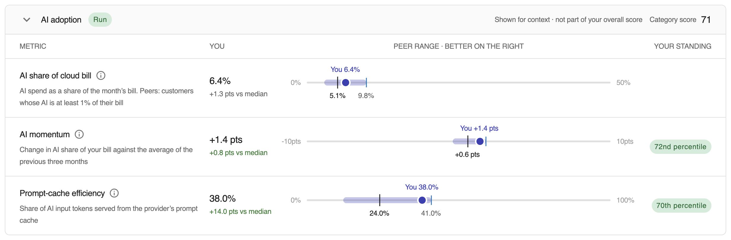
The AI adoption category shows how your use of generative AI compares with your peers. It's shown for context and is not part of your overall maturity score: its metrics never change your overall score, your stage, or the peer group distribution. The card has its own category score and stage, calculated from AI momentum and prompt-cache efficiency only.
| Metric | Description | Direction | Who counts as a peer |
|---|---|---|---|
| AI share of cloud bill | AI spend as a share of the month's cloud bill | Neither higher nor lower is better | Customers whose AI spend is at least 1% of their bill |
| AI momentum | AI share this month minus the average of the previous three months, in percentage points | Higher means faster adoption | AI adopters (at least 1% of the bill) with billing data for the three previous months |
| Prompt-cache efficiency | Cached input tokens as a share of all input tokens | Higher is better | Customers with at least 1 million input tokens in the month from AI providers that report cache reads |
AI share of cloud bill has no standing, because there's no better or worse share of AI in a bill. The card shows your value next to the peer median and the middle half of peers.
As with every other metric, an AI adoption metric is compared only when at least 10 customers in the peer group have a value for it; otherwise only your value is shown. If no AI spend is found in your billing data, the card says so and links to connecting your AI providers.
Reading a metric row
Each metric row displays four columns:
-
Metric: The metric name and a brief description.
-
You: Your current value and a delta showing the difference from the peer median or top quartile (depending on the Compare against toggle). A positive delta is green when it means you are outperforming the baseline, and red when you are underperforming. A sparkline shows your own value over the months in Your progress.
-
Peer range: A band chart showing the 25th--75th percentile range, the peer median as a vertical marker, and your position as a dot. A label below the chart indicates whether a higher or lower value is better for that metric.
-
Your standing: A percentile pill showing where you rank among your peers (e.g., 72nd percentile).
Hover over the peer range chart to see a tooltip with your exact value, the peer median, the top quartile value, and your percentile rank. Select the info button on the row, How this is calculated, to open its calculation panel.
A metric shows No data yet when there's no data source for it on your account, and only your value when too few peers report the metric to compare.
Calculation panels
The info button on each metric row and on the maturity score opens a side panel that explains the number for the month shown.
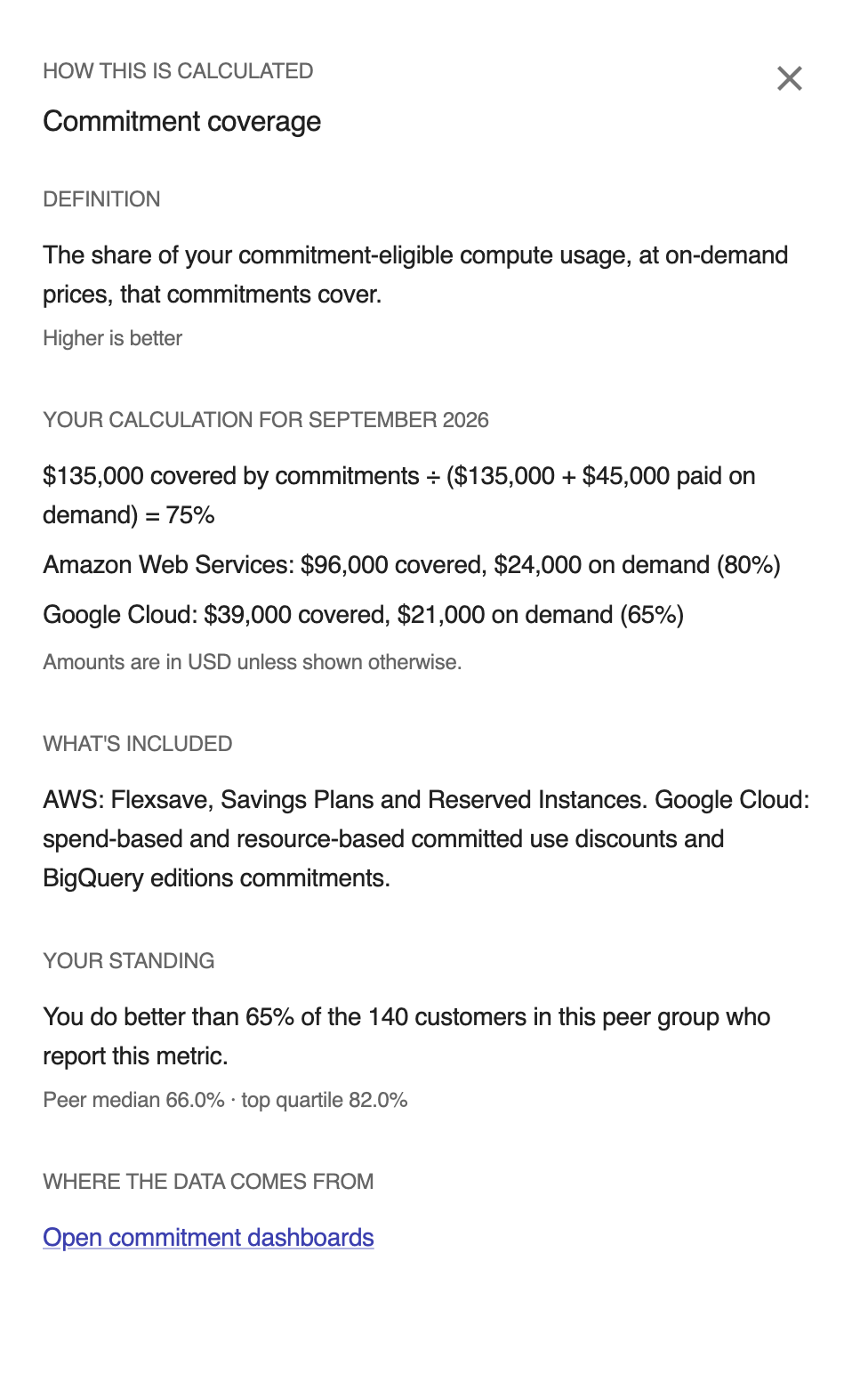
A metric's panel shows:
- Definition: What the metric measures and whether higher or lower is better.
- Your calculation for the month: The formula filled in with your own figures, for example, $41,200 potential savings from 37 insights ÷ $180,000 average monthly cloud spend = 22.9%. Amounts are in USD unless shown otherwise.
- What's included: The short form of the rules in How metrics are calculated.
- Where the data comes from: A link to the console page with the underlying data, such as Insights, Budgets, or Cost anomalies.
- Your standing: For example, You do better than 72% of the 143 customers in this peer group who report this metric, with the peer median and top quartile.
- A link to the matching section of this page.
When a metric has no value, the panel says why, for example, there were no critical anomalies that month, or fewer than 10 customers in the peer group report the metric.
The score panel lists every standing that went into your overall score and each category score, the averages that produced them, the metrics left out and why, the stage your score falls in, the peer group used and why it was chosen, and a reminder that AI adoption metrics are not part of your overall score.
Panels show only your own figures and the peer statistics already on the page: the 25th percentile, median, 75th percentile, and customer counts. No other customer's value is ever shown. Your figures are visible to anyone who can open the Benchmarks page for your account.
Calculation details are recorded from the month the panels were introduced. For earlier months, such as August 2026, the panel says Calculation details aren't available for this month and still shows the definition, your standing, and the peer statistics.
How metrics are calculated
Each metric is calculated for the previous calendar month from data you can already see in the DoiT console. Percentages are rounded to one decimal place. The examples in this section are illustrative and use the same layout as the calculation panels.
Preventable waste
The potential savings of your relevant insights over the month, as a percentage of your average monthly cloud spend. Lower is better.
- Included: Relevant, unresolved insights with savings. Insights already optimized or not relevant to your account are left out.
- Denominator: Your average monthly cloud spend over the last three months, the same figure used for your spend tier.
- Data source: Insights.
Example: $41,200 potential savings from 37 insights ÷ $180,000 average monthly cloud spend = 22.9%
The Insights page shows your insights as they are now, so its savings total can differ from the benchmarked month, and it isn't divided by your spend.
Effective savings rate
The difference between on-demand and paid cost for compute covered by Flexsave and PerfectScale for Commitments, as a percentage of on-demand cost. Higher is better.
- Included: Compute covered by Flexsave (Amazon Web Services and Google Cloud) and PerfectScale for Commitments.
- Data source: Flexsave and PerfectScale for Commitments savings.
Example: $120,000 on-demand cost − $86,400 paid = $33,600 saved, ÷ $120,000 = 28%
Commitment coverage
The share of commitment-eligible compute usage, at on-demand prices, that commitments cover. Higher is better.
- Included: For Amazon Web Services, Flexsave and your own Savings Plans and Reserved Instances. For Google Cloud, spend-based and resource-based committed use discounts and BigQuery editions commitments.
- Combined in dollars: Coverage across both clouds is added up in dollars, so the cloud with more eligible usage weighs more. The panel shows each cloud separately.
- Data source: Commitment dashboards.
Example:
- $60,000 covered by commitments ÷ ($60,000 + $30,000 paid on demand) = 66.7%
- Amazon Web Services: $52,000 covered, $18,000 on demand (74.3%)
- Google Cloud: $8,000 covered, $12,000 on demand (40%)
Budget coverage
The spend tracked by your active budgets, as a percentage of your average monthly cloud spend, capped at 100%. Higher is better.
- Included: Active, valid budgets that are not drafts. For a recurring budget, the spend of the period that covered the benchmarked month is used.
- Overlap: Overlapping budgets can track the same spend twice, which is why the value is capped at 100%.
- Data source: Budgets.
Example: $111,600 tracked by 12 active budgets ÷ $180,000 average monthly cloud spend = 62%
With overlapping budgets: $210,000 tracked by 15 active budgets ÷ $180,000 average monthly cloud spend, capped at 100%
Anomaly response time
The median time between detection and acknowledgment for the month's critical cost anomalies. Lower is better.
- Included: Critical anomalies only. Warning-level anomalies don't count.
- 7-day cap: A critical anomaly that isn't acknowledged, or takes longer than 7 days, counts as 7 days (168 hours).
- No anomalies: Months without critical anomalies have no value.
- Data source: Cost anomalies.
Example: five critical anomalies were acknowledged after 3, 9, and 41 hours, one after 9 days, and one not at all. The last two count as 168 hours, so the sorted times are 3, 9, 41, 168, and 168 hours.
Median of 5 critical anomalies = 41h (2 counted at the 7-day cap)
Tagging & allocation coverage
The higher of two shares of your spend: spend carrying a label or tag you applied (labels added automatically by cloud providers don't count), and spend matched by one of your own allocation rules. Higher is better.
- Excluded: Spend that can't be tagged or allocated, such as Marketplace purchases, taxes, refunds, and credits, is left out of both shares.
- Included: Shared costs such as networking stay in, because you can split them with allocation rules.
- Data source: Allocations and your labels and tags.
Example:
- Tagged share 61.4% · allocated share 74%
- The higher one, your allocated share, is your value.
AI share of cloud bill
AI spend as a share of your month's cloud bill. This metric has no better direction and no standing, and it's not part of any score.
- Included: Spend DoiT labels as GenAI across your connected clouds and AI providers.
- Peers: Only customers whose AI spend is at least 1% of their bill count toward the peer median and middle half.
- Data source: The GenAI Intelligence dashboard.
Example: $9,360 AI spend ÷ $180,000 cloud bill = 5.2%
AI momentum
How your AI share of the bill moved: this month's share minus the average share of the previous three months, in percentage points. Higher means faster adoption. It's shown for context and is not part of your overall score.
- Included: Measured when AI spend is at least 1% of your bill this month and each of the three previous months has billing data. A previous month with no AI spend counts as 0%.
- Data source: The GenAI Intelligence dashboard.
Example: 5.2% this month − 3.8% average of the three months before (3.1%, 3.8%, 4.5%), a momentum of +1.4 points.
Prompt-cache efficiency
The share of your AI input tokens served from the provider's prompt cache, which costs a fraction of fresh input. Input tokens include fresh input, cache reads, and cache writes. Higher is better. It's shown for context and is not part of your overall score.
- Included: Only AI providers that report cache reads. A provider with no cache reads in the month is left out of both the cached and the total input tokens.
- Floor: Measured only with at least 1 million input tokens in the month from those providers.
- Data source: The GenAI Intelligence dashboard.
Example: 412M cached input tokens ÷ 1.3B input tokens = 31.7%
Monthly refresh
Benchmarks are recomputed on the 2nd of every month for the month that just ended. The footer shows which month the figures cover.
Before your first benchmarks
Benchmarks are computed for customers with billing data in DoiT. If your account doesn't have benchmarks yet, a notice appears at the top of the page and the page shows sample data so you can see what to expect. The sample figures are not yours.
Data privacy
Benchmarks are recomputed monthly from anonymized, aggregated data. Peer groups publish only the 25th percentile, median, and 75th percentile of each metric, a customer count, and the shape of the score distribution. Customer names, identifiers, and individual values are never shown, and every peer group includes at least 10 customers. Your data is never shared with or identifiable to other customers.
FAQ
My score dropped, but we didn't change anything
Standings rank you against your peers, so your score moves when they do. Check the list of what changed on the Your progress card: a line such as Budget coverage −6 (you ±0, peers −6) means your own value held steady and your peers improved. A drop can also come from a change of peer group, which the chart marks. See Why a score can drop while you improve.
Why does a metric have no value or no standing?
- No data yet: There's no data source for the metric on your account, for example, no commitment-eligible compute, no active budgets, or no AI spend.
- No critical anomalies: Anomaly response time has no value in a month without critical anomalies.
- Below a floor: AI momentum needs AI spend of at least 1% of your bill and billing data for the three previous months. Prompt-cache efficiency needs at least 1 million input tokens from providers that report cache reads.
- Too few peers: When fewer than 10 customers in the peer group report a metric, only your value is shown, with no standing.
- AI share of cloud bill: It never has a standing, because no share is better than another.
A metric without a standing doesn't count toward your score. The calculation panel for the metric says which case applies.
Why is my peer group different from last month?
Your spend tier comes from your average monthly cloud spend over the last three months, so it changes when that average crosses a tier boundary: $50K, $250K, or $1M per month. If your exact spend tier and industry have fewer than 10 customers in a month, a broader group is used for that month. Each month on the progress card is scored against the group you were in that month.
Why do the numbers differ from a report I built?
Common reasons:
- Time range: Benchmarks cover one full calendar month, the month that just ended. A report may cover a different range or include the current, partial month.
- Denominator: Preventable waste and budget coverage divide by your average monthly cloud spend over the last three months, not by the benchmarked month's spend.
- Cost type: A report may use a different cost view, for example, with or without credits, amortized commitments, or Marketplace purchases, which tagging & allocation coverage leaves out.
- Currency: Calculation panel amounts are in USD unless shown otherwise; a report may use your account's currency.
- Rounding: Percentages are rounded to one decimal place, and scores to whole numbers.
- Timing: Benchmarks are computed once, after the month closes. Data that changes later, such as an anomaly acknowledged after the run, isn't reflected in that month.
The calculation panel shows the exact figures used, which you can compare with the source data it links to.
Why isn't AI share of cloud bill scored?
A larger or smaller share of AI in your bill isn't better or worse in itself: it depends on your business. AI share is shown so you can see where you sit among AI adopters, and AI momentum and prompt-cache efficiency show how your adoption is moving and how efficiently you use it. None of the AI adoption metrics change your overall maturity score.
How often are benchmarks recomputed?
Once a month, on the 2nd, for the month that just ended. Figures for a month don't change after that unless DoiT recomputes the month, for example, to add calculation details.
Who can see my data?
Your own figures, standings, and calculation panels are visible to anyone who can open the Benchmarks page for your account. Other customers only ever see anonymized, aggregated peer statistics, and only for groups of at least 10 customers. See Data privacy.