ベンチマーク
Benchmarks ページでは、お客様の FinOps 実践状況が、匿名化された DoiT 顧客と比較してどのような位置付けにあるかを確認できます。全体の成熟度スコア(0--100)に基づき、Crawl・Walk・Run のいずれかのステージに分類され、ヒストグラムで同業他社グループ内での相対的な位置が表示されます。2 つのカテゴリカードではスコアが個別のメトリクスに分解され、改善すべき具体的な領域を特定できます。
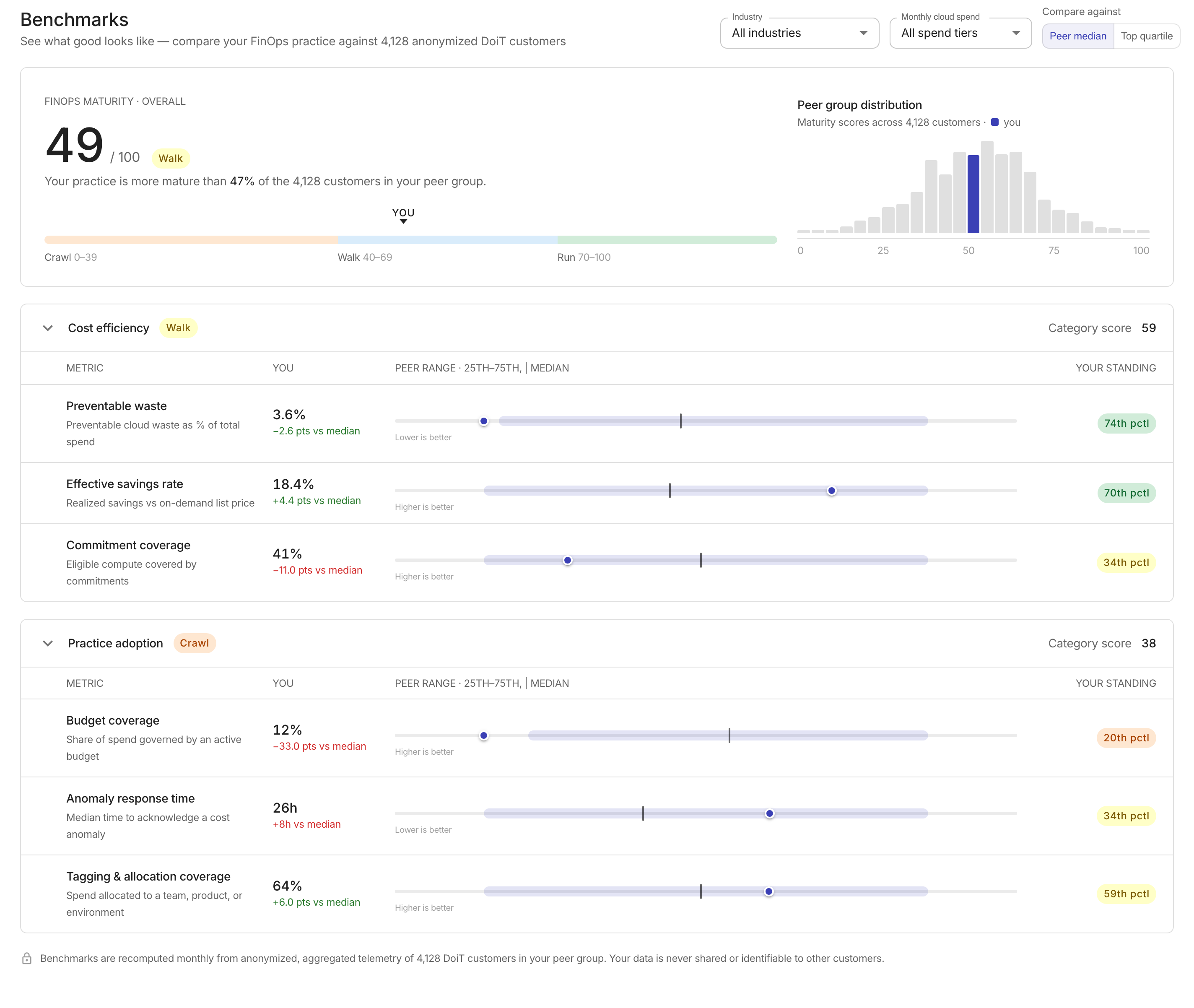
Benchmarks にアクセスするには、DoiT コンソール で Reporting and analytics > Benchmarks に移動します。
Filters
ページ上部のコントロールを使用して、ピアグループを絞り込み、比較の基準を変更します。フィルターを変更すると、すべてのスコア・差分・ヒストグラムが更新されます。
-
Industry: ピアグループを特定の業種に限定します。選択肢には、All industries・Software & SaaS・Financial services・Retail & e-commerce・Media & gaming・Healthcare があります。
-
Monthly cloud spend: ピアグループを支出階層で限定します。選択肢には、All spend tiers・Under $50K/mo・$50K--$250K/mo・$250K--$1M/mo・Over $1M/mo があります。
-
Compare against: Peer median と Top quartile を切り替えて、メトリック差分の算出に使用する基準を変更します。
Maturity score
ページ上部のメインカードには、0--100 スケールで算出された全体の FinOps 成熟度スコアが表示されます。このスコアは、2 つのカテゴリスコア(Cost efficiency と Practice adoption)の平均値です。
ステージピルが現在の成熟度ステージを示します。
| Stage | Score range |
|---|---|
| Crawl | 0--39 |
| Walk | 40--69 |
| Run | 70--100 |
スコアの下にあるステージバーには 3 つのステージが表示され、YOU マーカーでお客様の位置が示されます。

Peer group distribution
成熟度スコアの横には、ピアグループ内の顧客における成熟度スコアの分布を示すヒストグラムが表示されます。ヒストグラム上ではお客様の位置がハイライトされ、概要行で「どの程度のパーセンテージのピアを上回っているか」が示されます。
Category cards
成熟度スコアの下には、2 つの折りたたみ可能なカテゴリカードがあり、パフォーマンスを個々のメトリクスに分解して表示します。各カードには、そのカテゴリのスコアとステージピルが表示されます。カードヘッダーを選択して展開または折りたたんでください。
Cost efficiency
Cost efficiency カテゴリは、クラウド支出をどれだけ効率的に管理できているかを測定します。次のメトリクスが含まれます。
| Metric | Description | Direction |
|---|---|---|
| Preventable waste | 総支出に対する削減可能なクラウドコストのパーセンテージ | 値が低いほど良い |
| Effective savings rate | オンデマンドの標準価格と比較した実現済みのコスト削減率 | 値が高いほど良い |
| Commitment coverage | コミットメントでカバーされている対象コンピュートのパーセンテージ | 値が高いほど良い |
Practice adoption
Practice adoption カテゴリは、FinOps の運用プラクティスがどの程度実践されているかを測定します。次のメトリクスが含まれます。
| Metric | Description | Direction |
|---|---|---|
| Budget coverage | 有効な予算によって管理されている支出の割合 | 値が高いほど良い |
| Anomaly response time | コストアノマリーを確認するまでの中央値時間 | 値が低いほど良い |
| Tagging & allocation coverage | チーム・プロダクト・環境にアロケーションされている支出の割合 | 値が高いほど良い |
Reading a metric row
各メトリック行には 4 列が表示されます。
-
Metric: メトリック名と簡潔な説明。
-
You: 現在の値と、ピアの中央値またはトップクォータイル(Compare against の設定に応じて)との差分。プラスの差分がベースラインを上回っている場合は緑色で表示され、下回っている場合は赤色で表示されます。
-
Peer range: 25--75 パーセンタイル範囲を示す帯グラフと、縦線で示されるピアの中央値、および点で示されるお客様の位置。グラフの下には、そのメトリックについて値が高い方が良いのか低い方が良いのかを示すラベルが表示されます。
-
Your standing: ピアとの相対的な順位を示すパーセンタイルピル(例: 72nd pctl)。
ピアレンジチャートにカーソルを合わせると、お客様の正確な値・ピアの中央値・トップクォータイルの値・お客様のパーセンタイル順位がツールチップで表示されます。
Data privacy
ベンチマークは、匿名化・集計されたテレメトリに基づき、毎月再計算されます。お客様のデータが他の顧客と共有されたり、個人を特定できる形で開示されたりすることは決してありません。